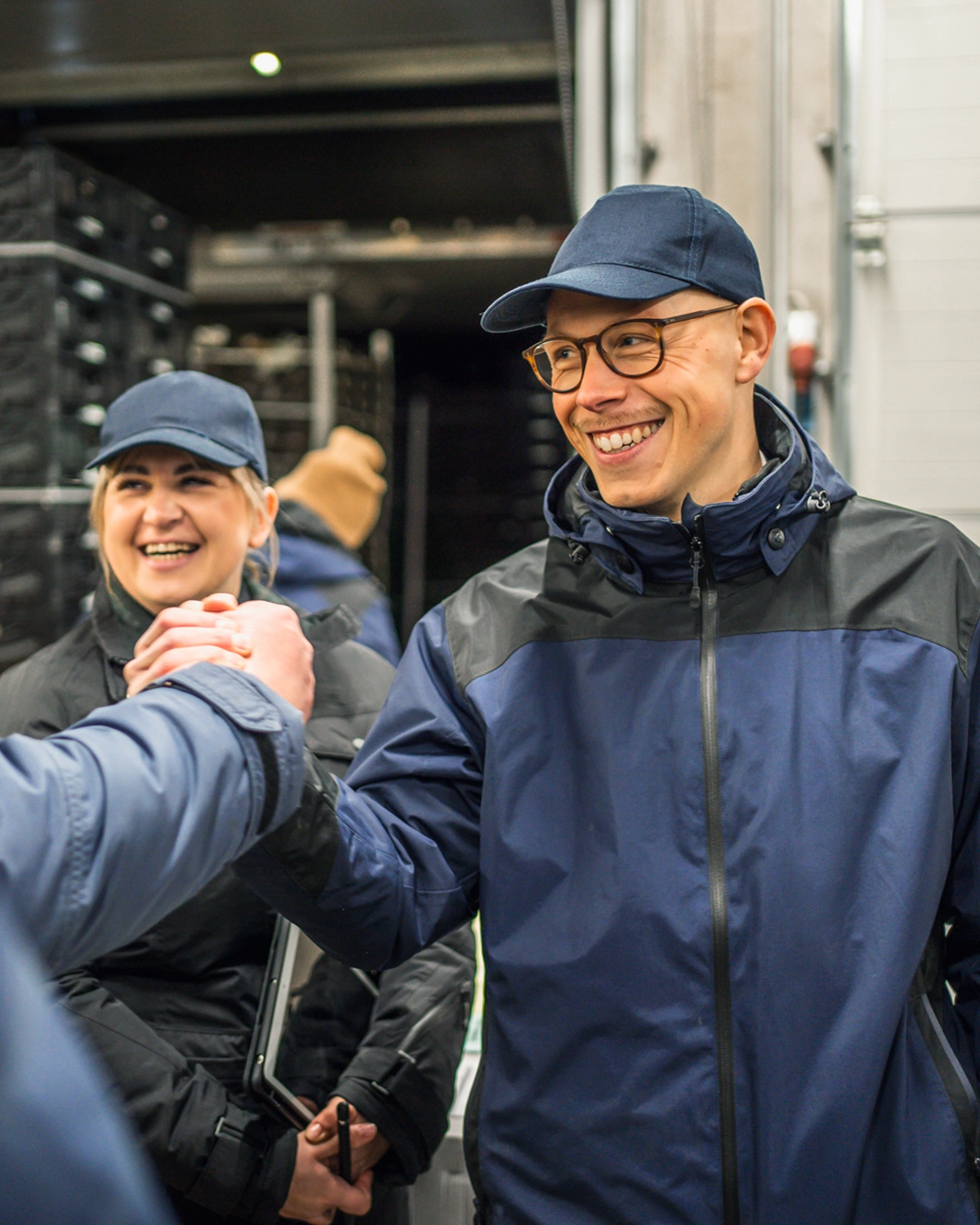
For over 50 years, Fruchthansa has brought fruit and vegetables to markets regionally and globally – from production to distribution – combining tradition and experience with innovative supply chain expertise as a family business.
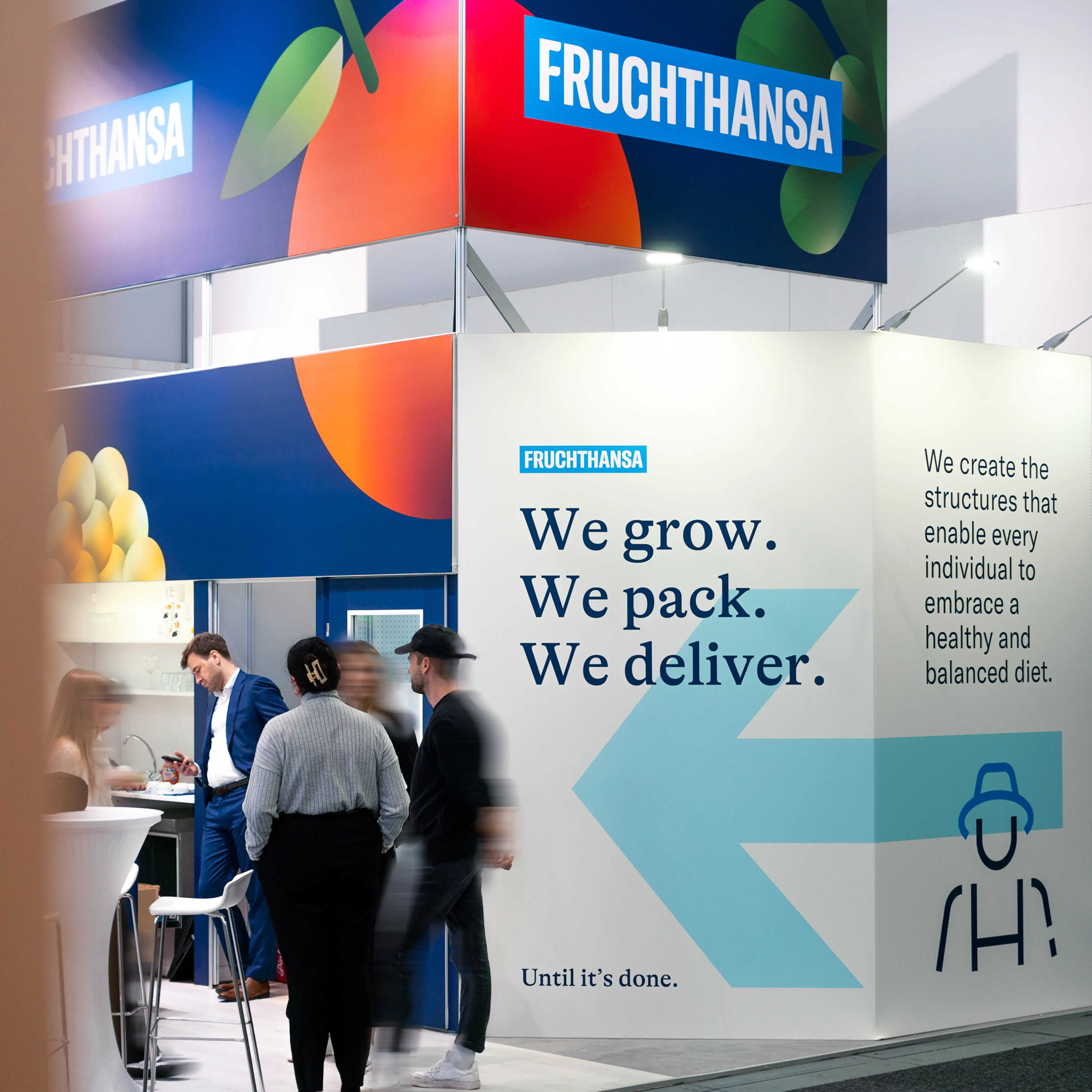
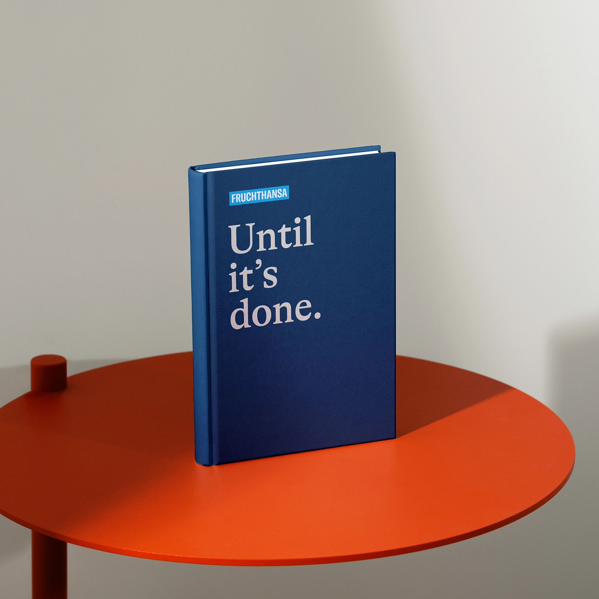
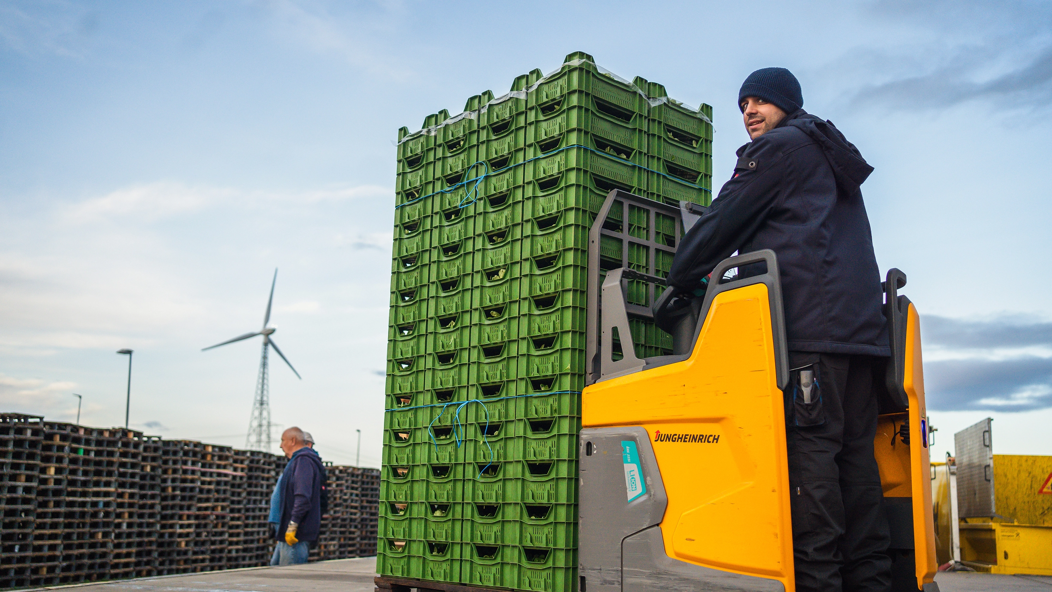
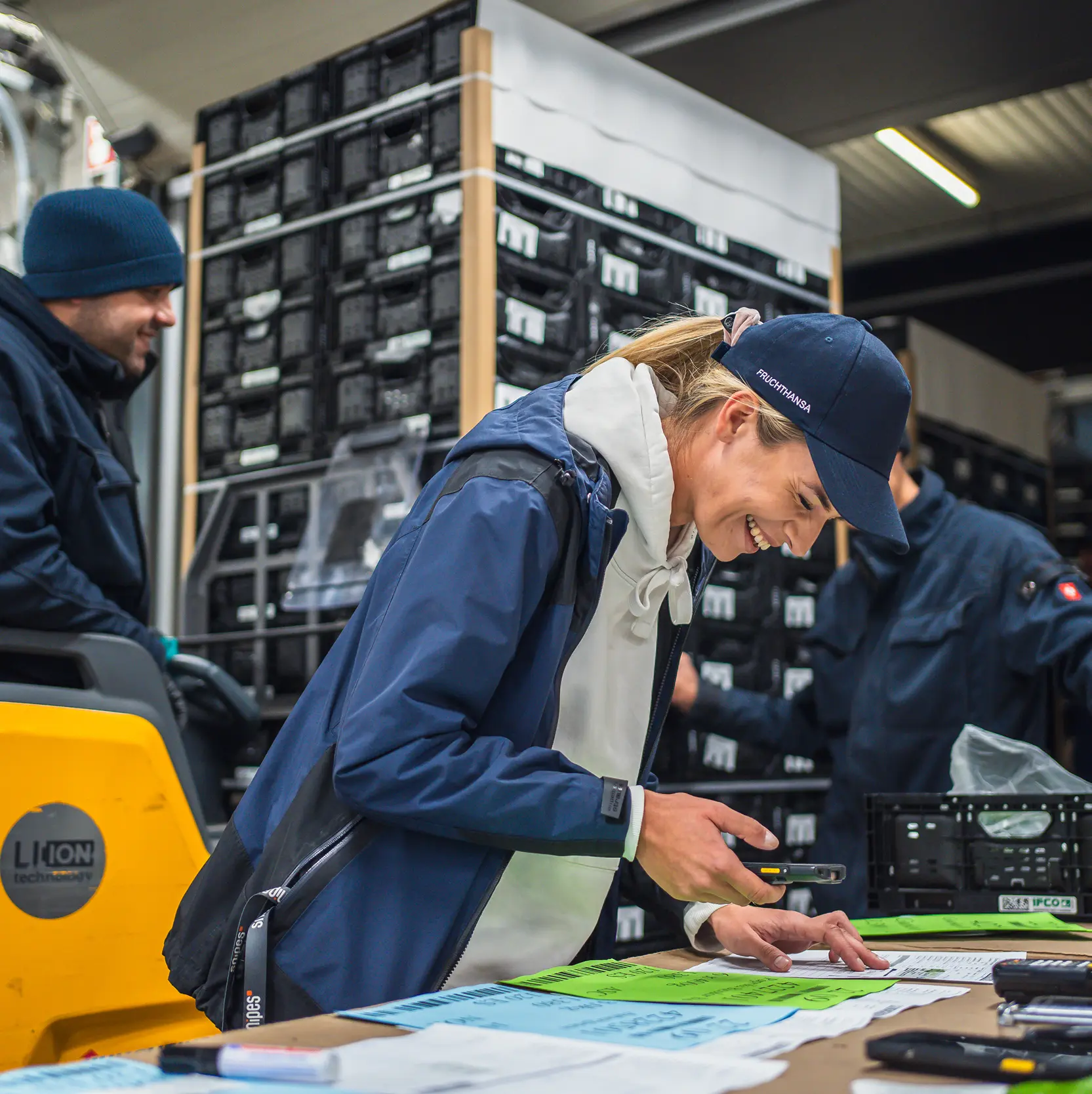
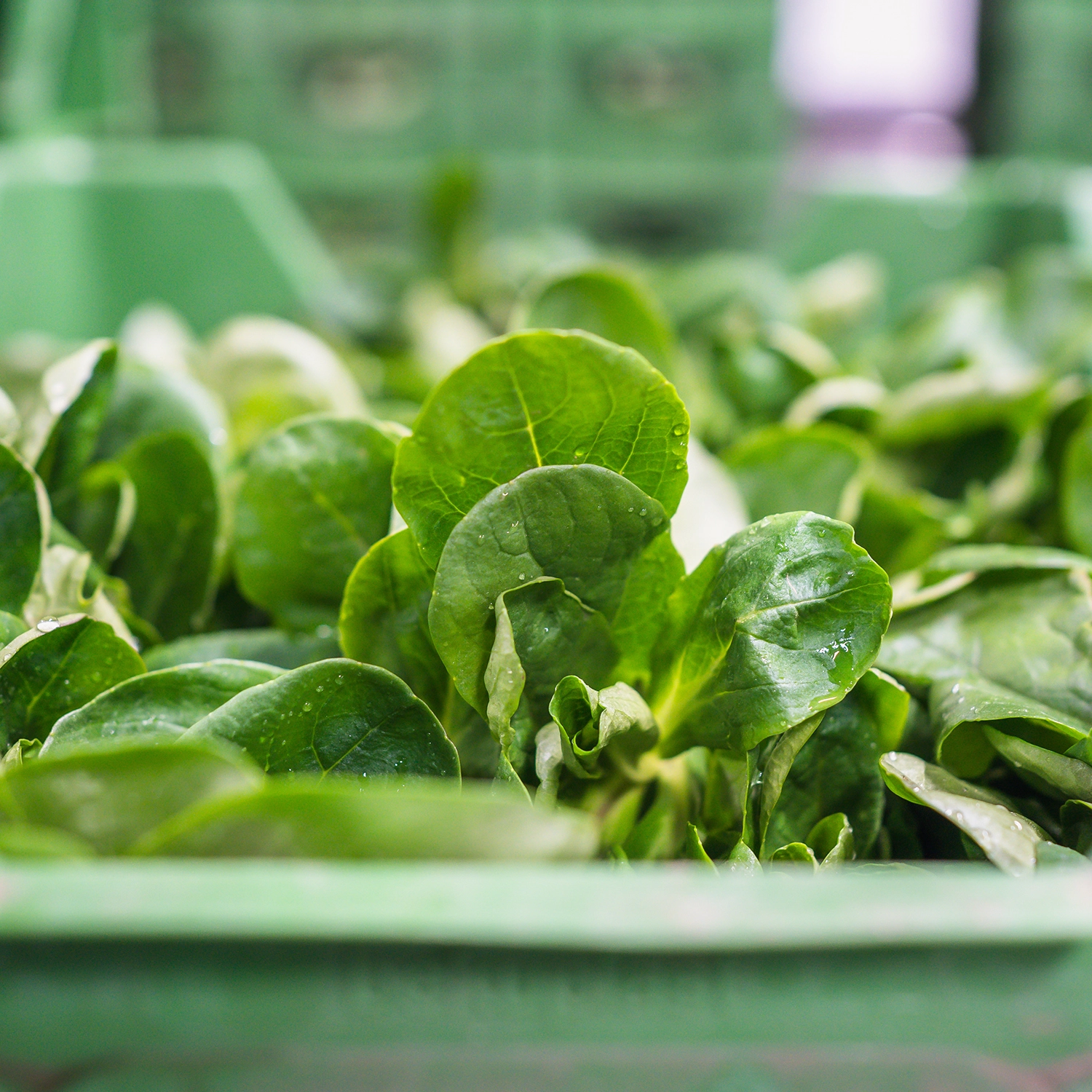
The aim of the rebrand was to create a clear, consistent brand identity that brings together the natural character, variety and emotional appeal of the products with the structure and reliability of the logistics company. The new design is built around the guiding idea developed together: We grow. We pack. We deliver. Until it’s done.
.webp)
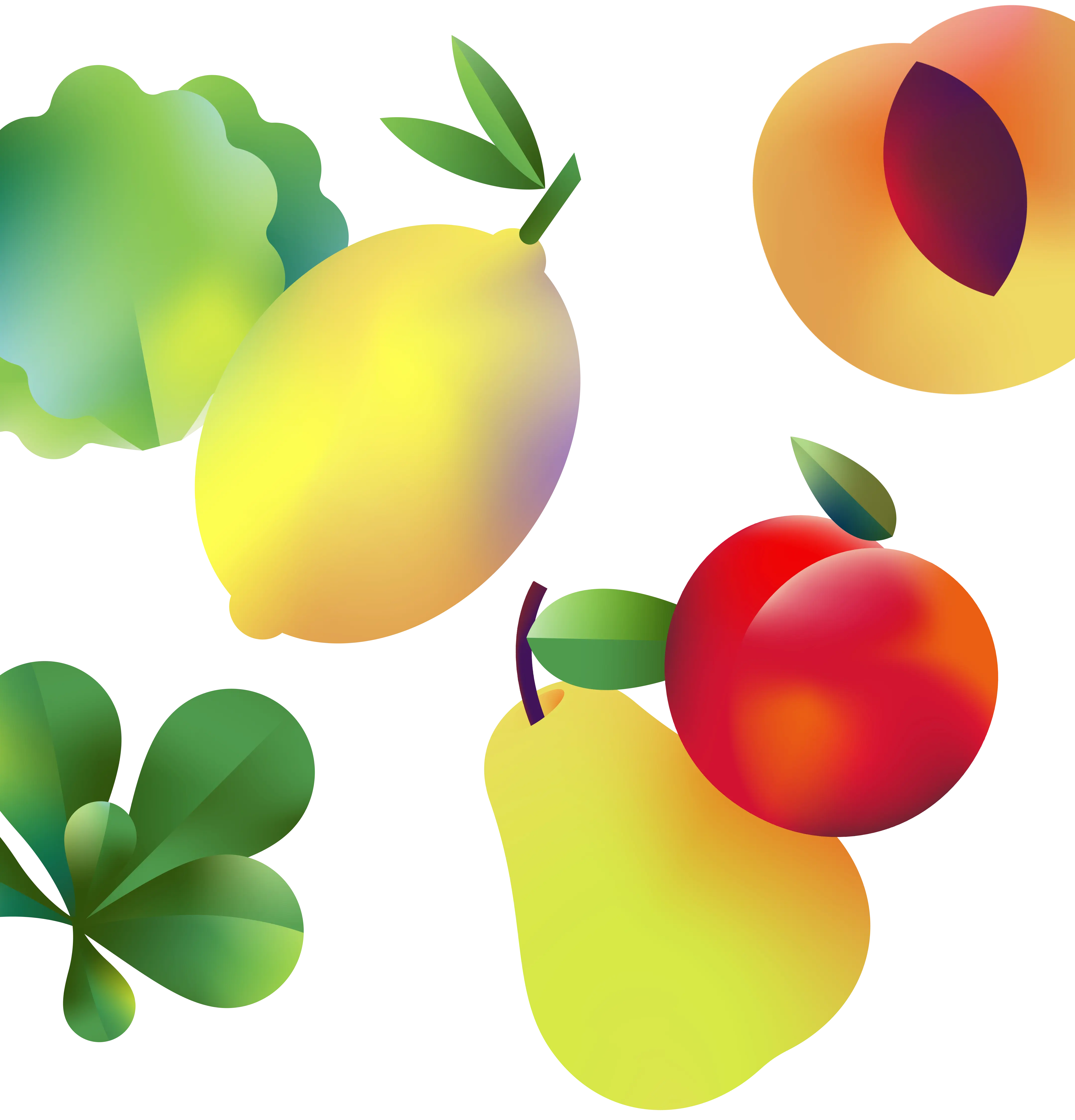

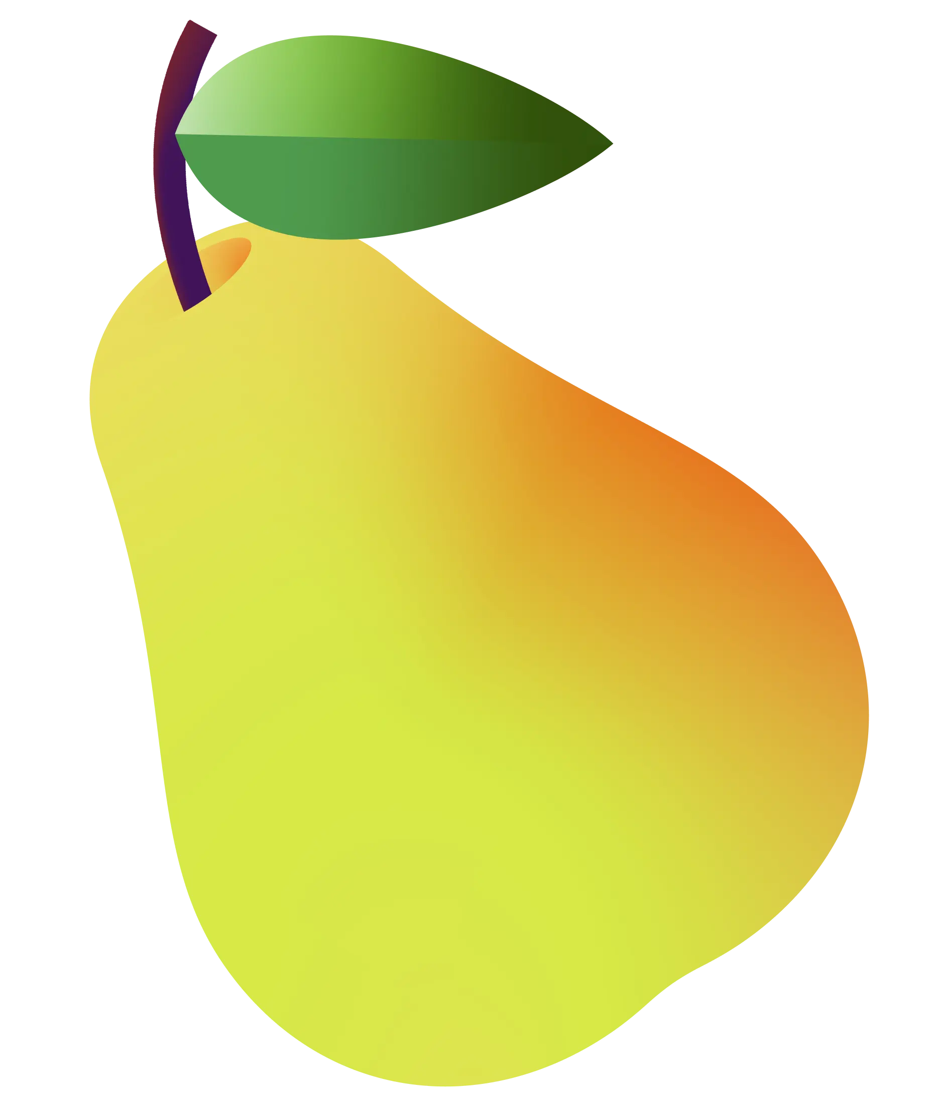




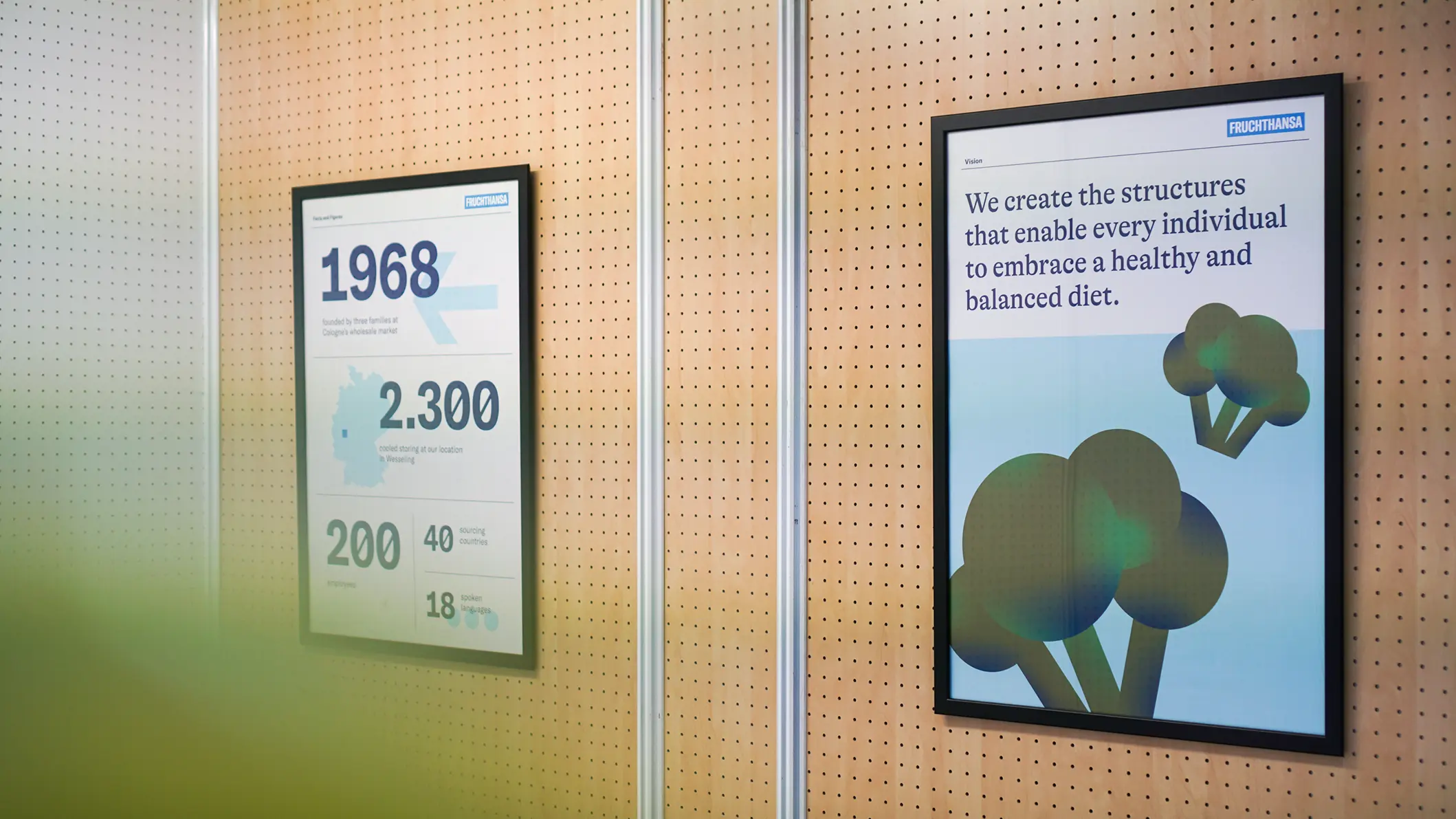
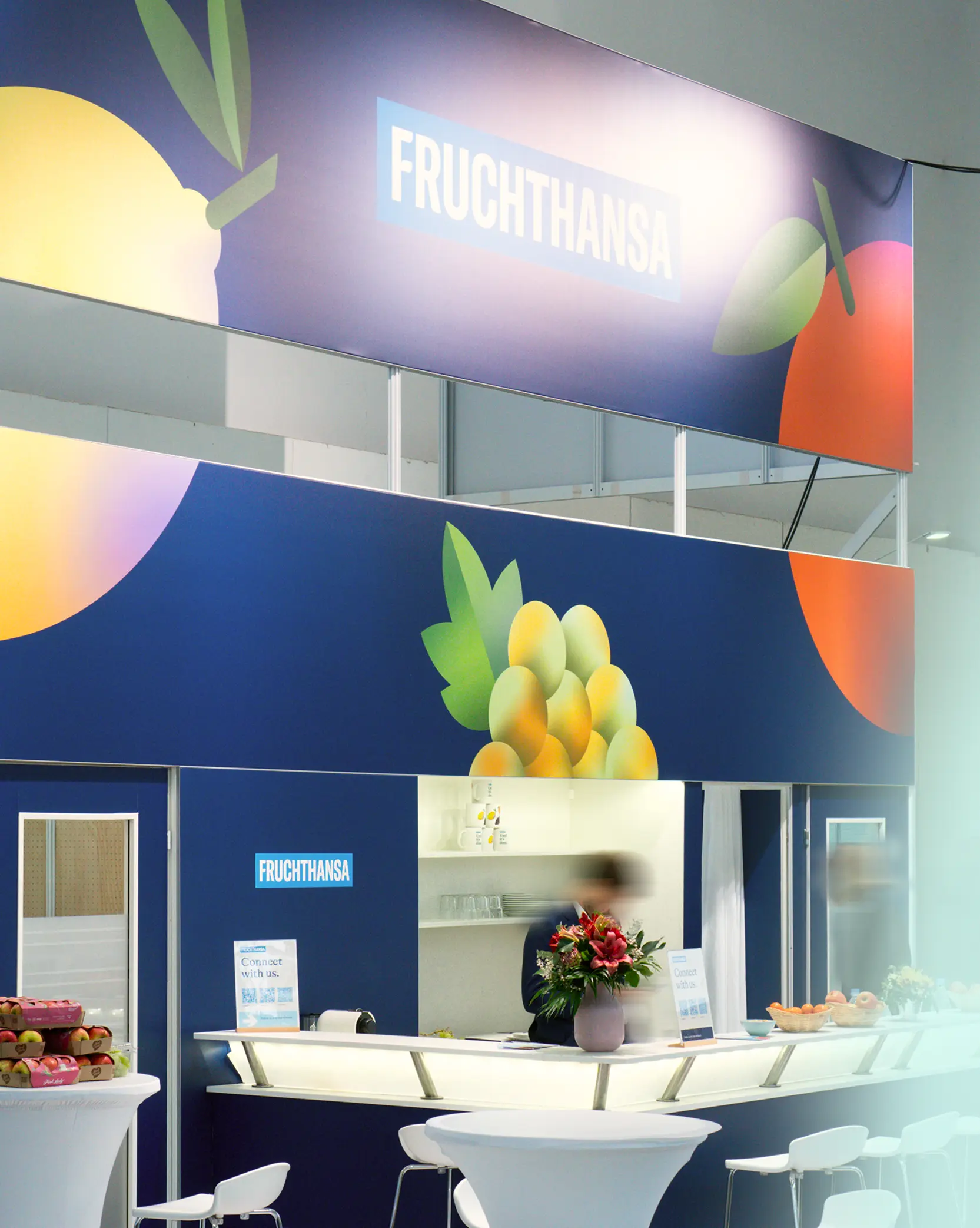
The design grows out of the nature of the product: typography with organic touches, a colour palette drawn directly from the products, and illustrations with realistic depth form the visual foundation. Animations take their cues from natural growth processes, bringing movement to the system. The result is a living design that makes development visible and conveys a tangible sense of continuous growth.
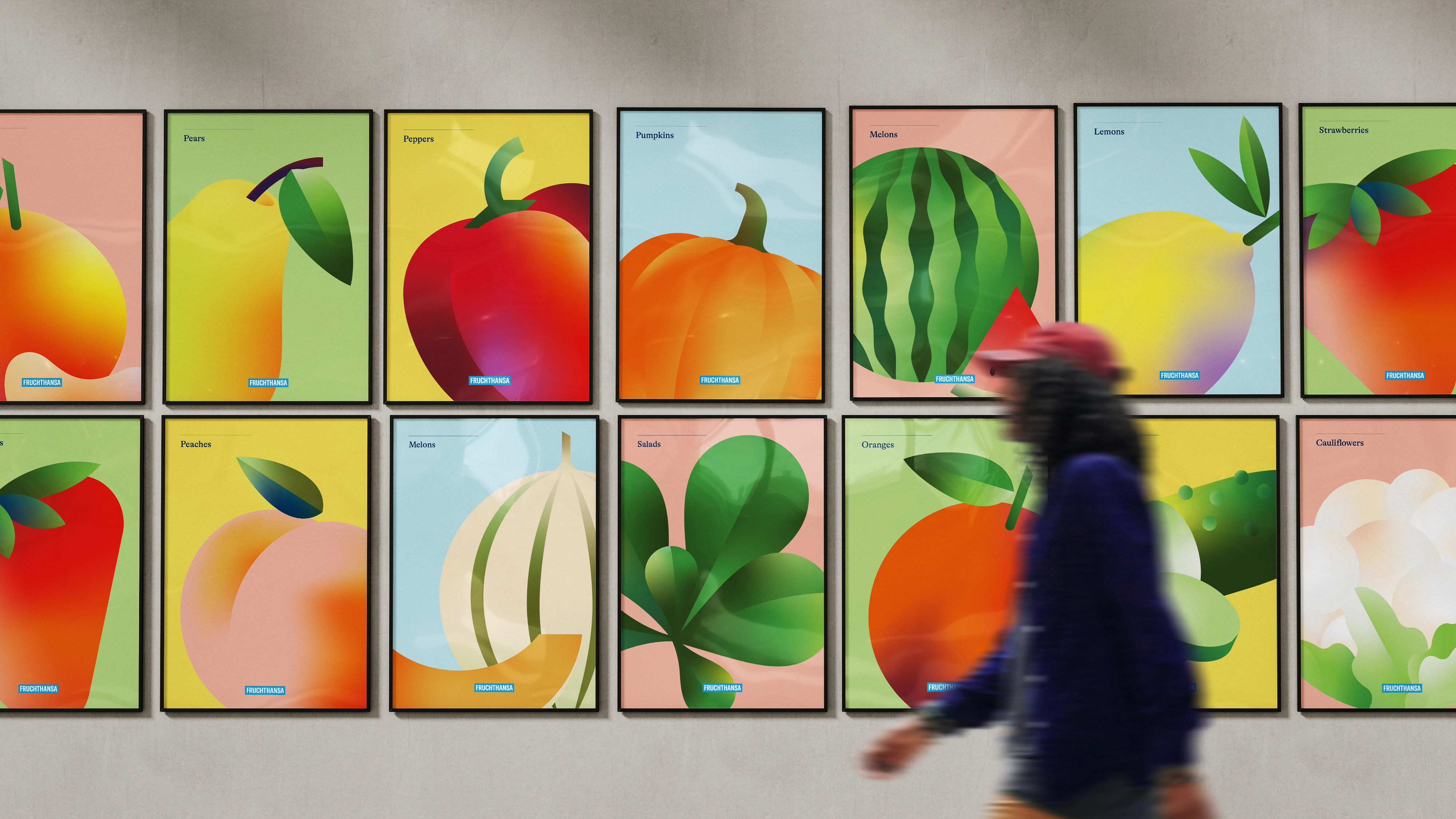
Clear design elements, diagrams and purposeful animations make the structure and innovative logistics visible. They guide people through processes and markets, becoming tangible elements of the brand identity. The design is shaped by the business areas, bringing clarity, direction and dynamism together in a visual system that conveys experience, precision and efficient operations.