Health Routine develops health products at the intersection of nature and science. With plans to enter pharmacies and appeal to a more mature audience, the brand identity has been refined to convey trust, guidance and scientific expertise more clearly. The new identity positions Health Routine as an evidence-based health brand that fits into everyday life.
.jpg)
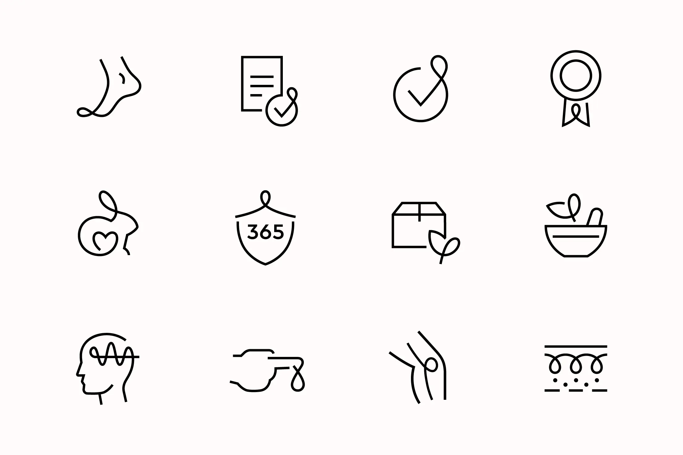
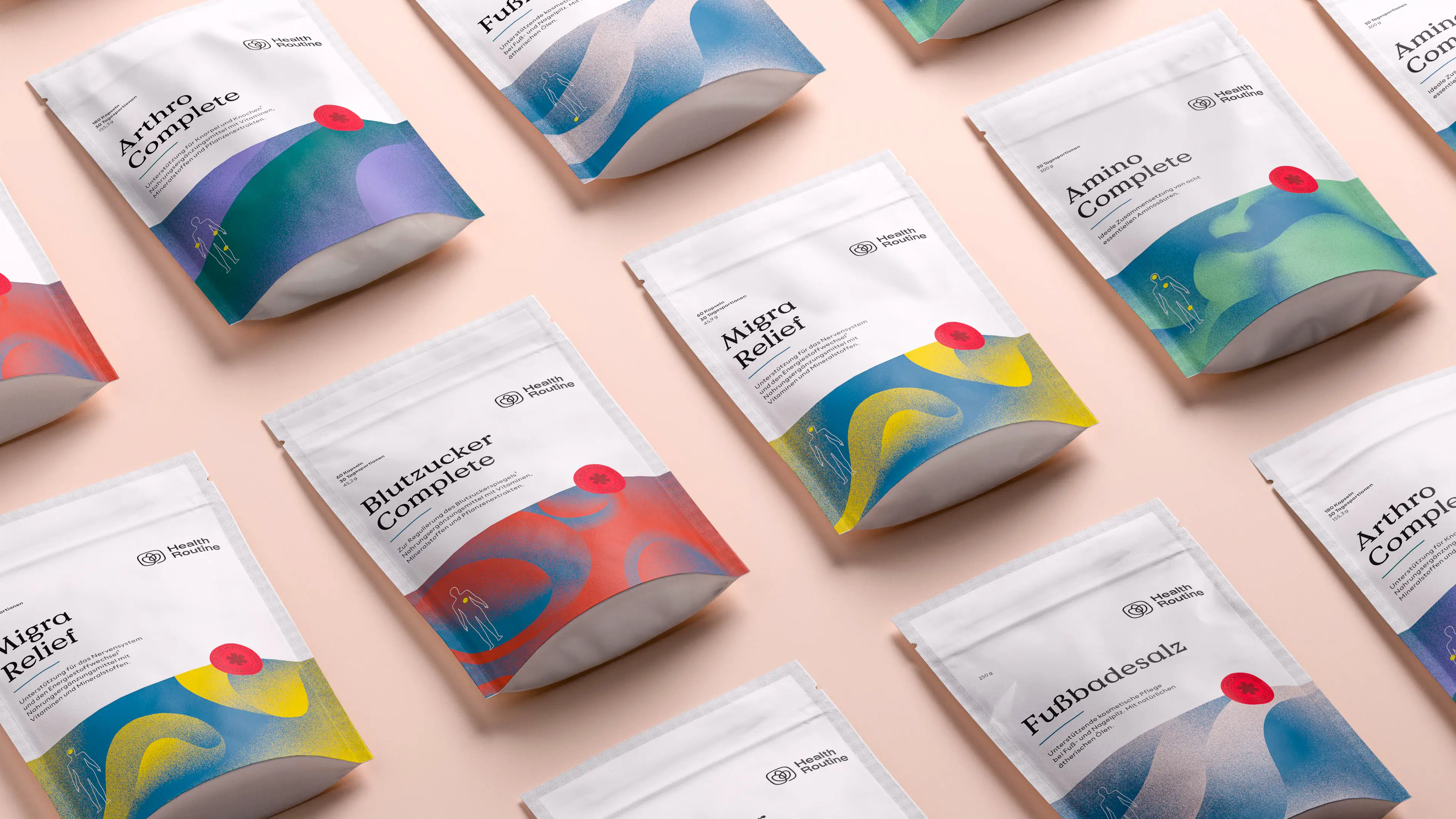
The corporate design translates the strategic direction into a precise visual language. Clear structures convey scientific expertise and provide guidance, while organic forms represent naturalness and humanity. Accessible typography and a calm, positive colour palette strike a balance between professionalism and approachability.
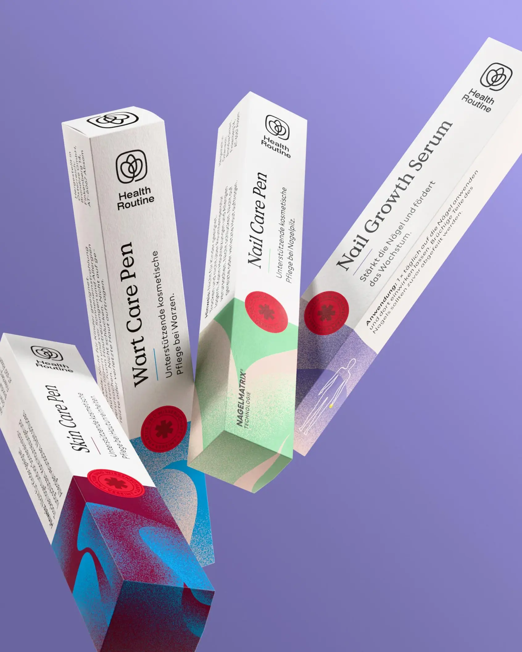
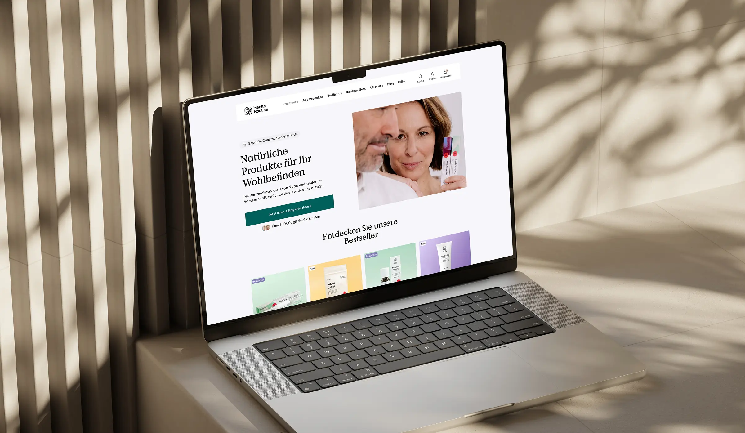
The design system has been carried through consistently across key brand touchpoints, from packaging and marketing materials to digital platforms. This creates a coherent brand identity that feels equally at home in pharmacies and in everyday life.
.webp)
.webp)