Tark Thermal Solutions (formerly Laird Thermal Systems) provides innovative thermal management solutions worldwide: technologies that meet the complex demands of a dynamic industry. Following the acquisition of Tark Inc., one thing was clear: this was about more than just a name change — it was a transformation that would establish a new identity and reposition the company, drawing on its established expertise and ambition to lead.
The aim of developing the new brand strategy was to reflect the company’s entrepreneurial spirit of innovation and its steadily growing technological expertise. During an extensive workshop attended by participants from the company’s global network, the essence of the new brand identity was defined through a collaborative strategic process. The result: an identity that combines Tark Thermal Solutions’ technological expertise with a clear stance, underpinned by the values of transparency, synergy, ambition and adaptability. This is brought to life through a brand architecture that makes these principles tangible in a systematic and consistent way.
The strategic repositioning began with the name – and went far beyond it. Tark Thermal Solutions stands for openness, agility and global connectivity – a culture of innovation that is also reflected in its organisational structure: as an international company with locations in China, the Czech Republic, Sweden, the USA and Germany, it has deliberately adopted a decentralised structure. This structure promotes diversity and adaptability, enabling the company to respond quickly to market conditions. It is not only a strategic strength, but also an integral part of the brand’s identity.
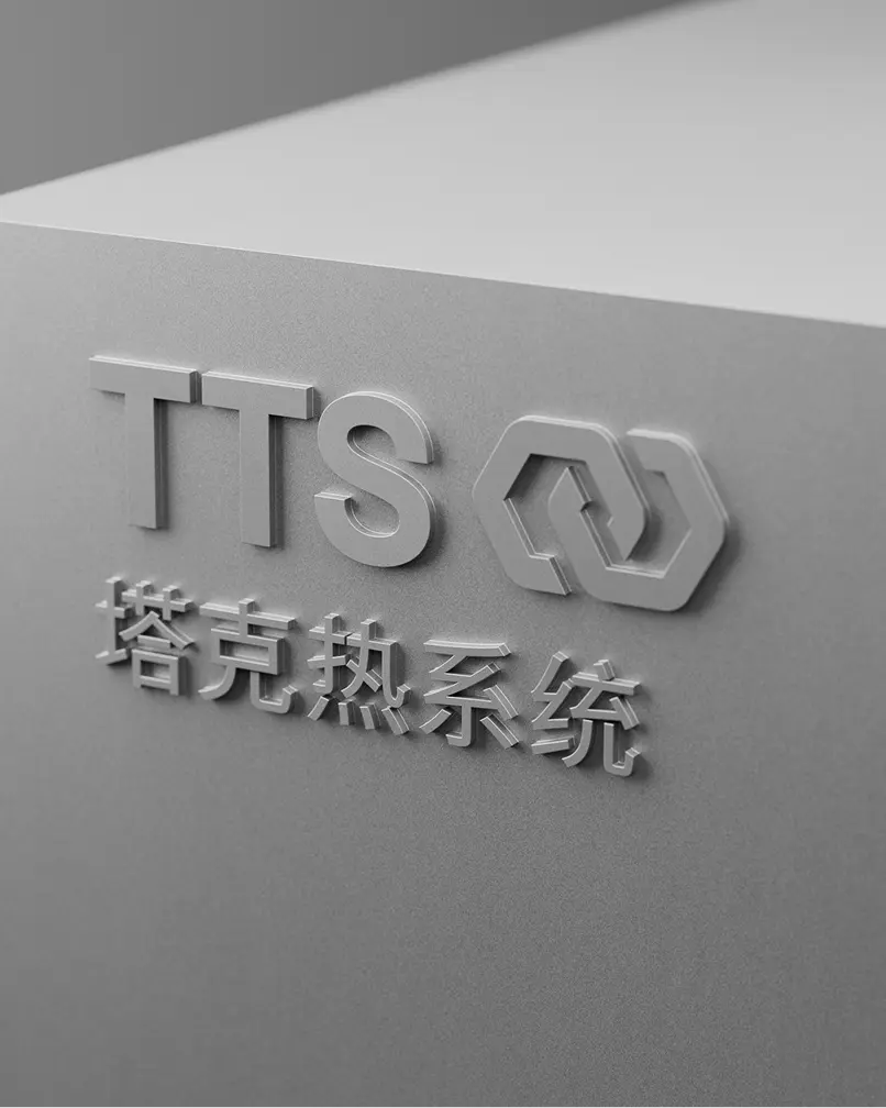
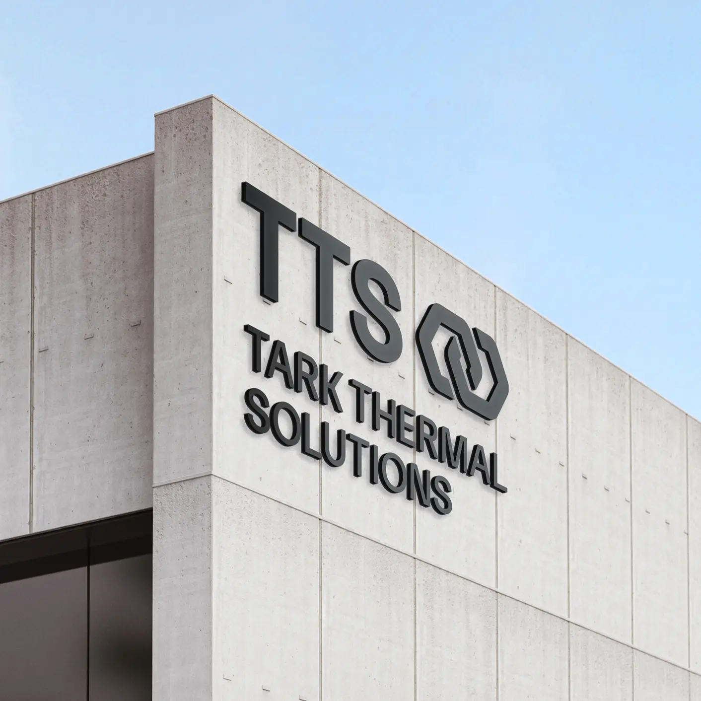
The newly defined brand strategy, guided by the idea of synergy, forms the basis for a credible brand promise that resonates at every level and thus becomes the visual principle of the new design system.
A flexible design system translates the strategic brand idea into form, colour, typography and structure: dynamic clusters bring together movement and stability, while a hexagonal structure enables flexible exchange and individual adaptability.
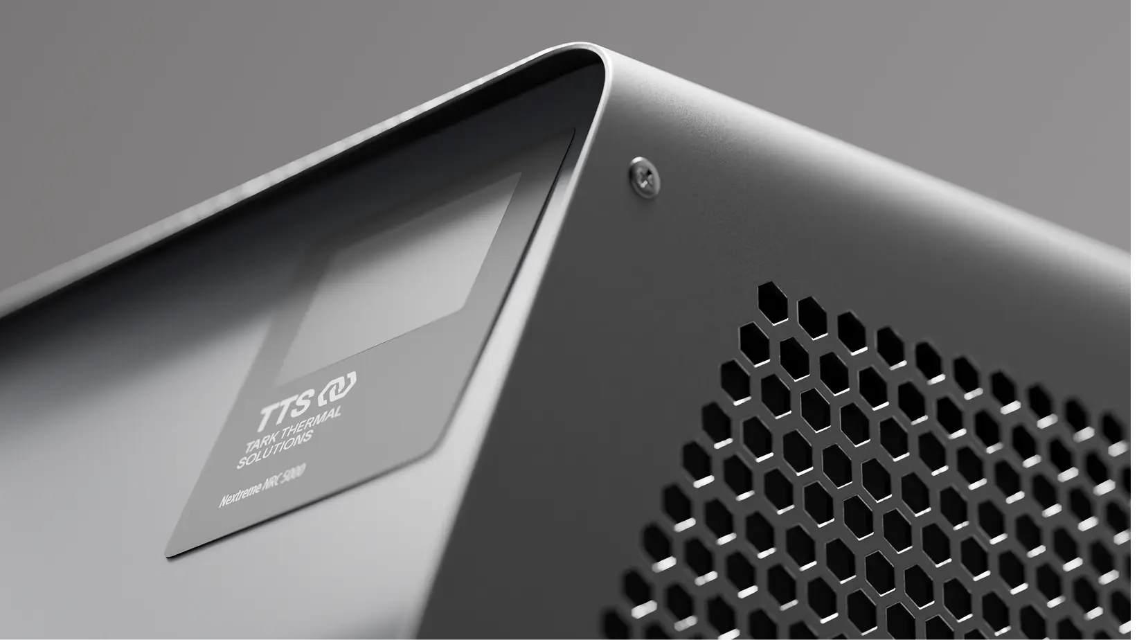
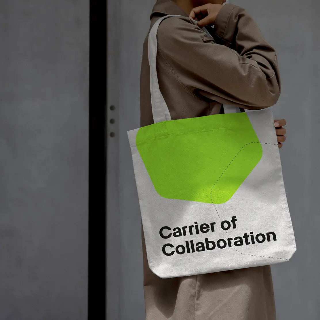
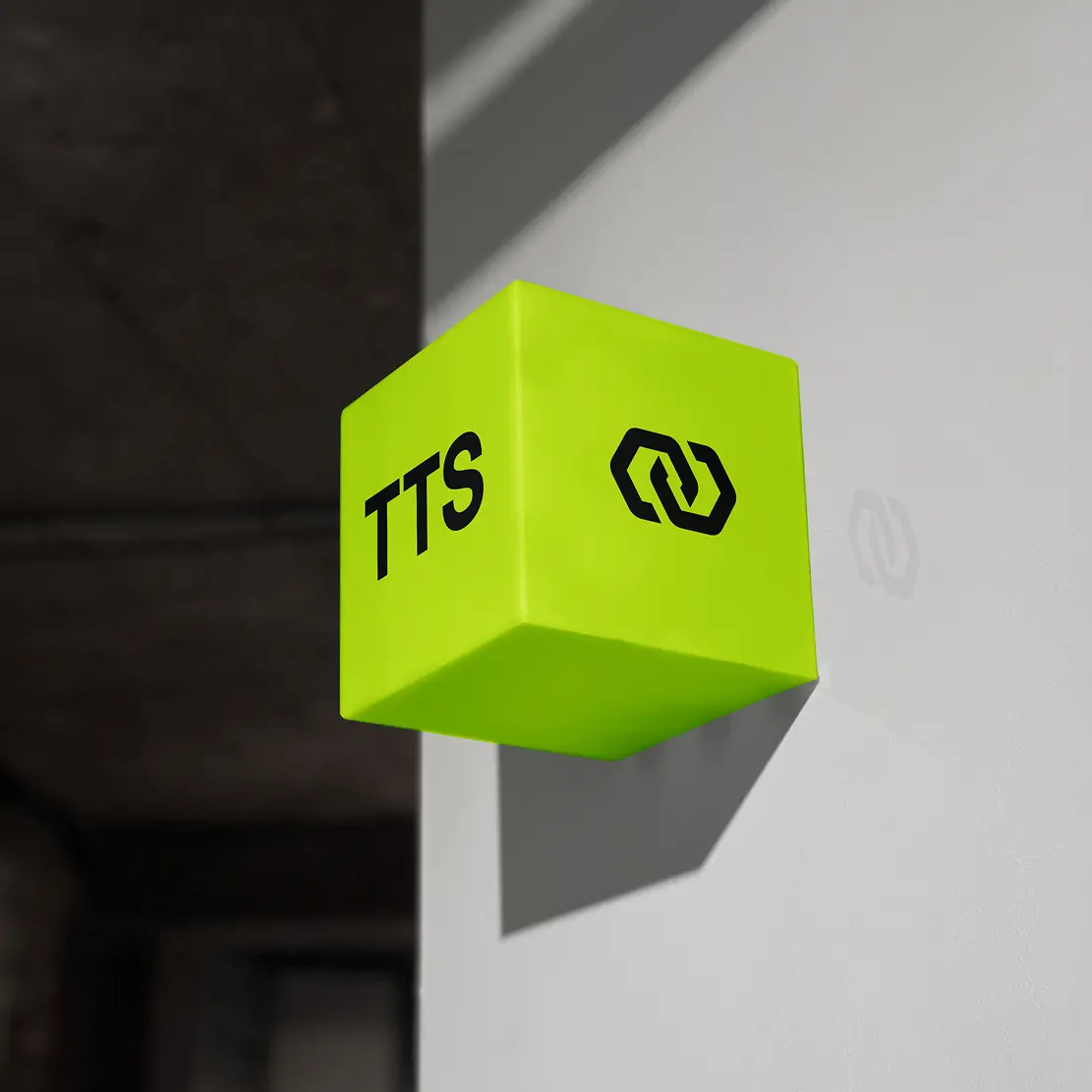
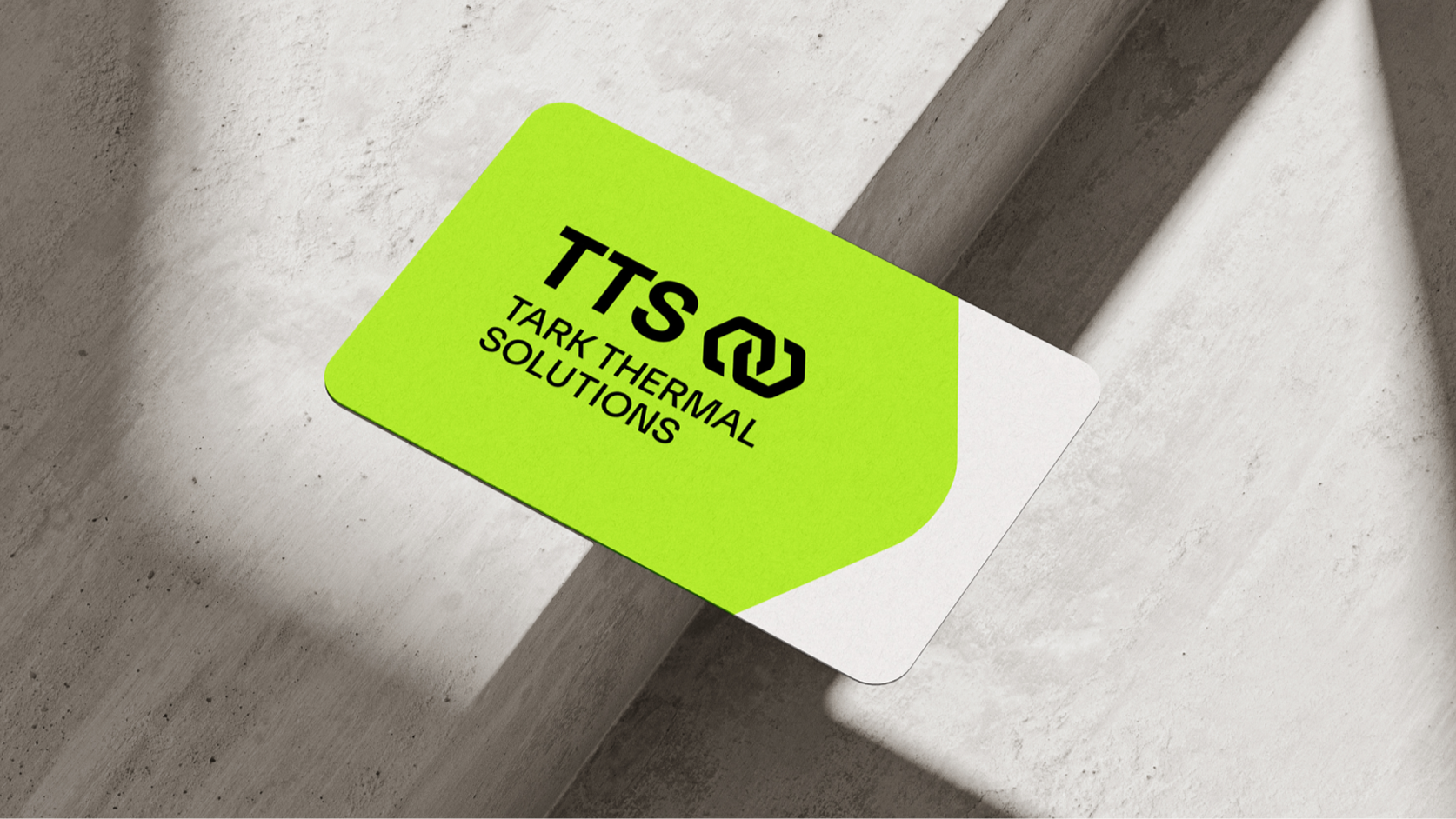
Green represents evolution, innovation and naturalness – and was often the first light to appear on technical displays. In Tark Thermal Solutions’ colour palette, green marks the controlled midpoint between heat (red) and cold (blue): a symbol of functional balance, technological precision and continuous improvement – and a powerful differentiator in the competitive landscape.
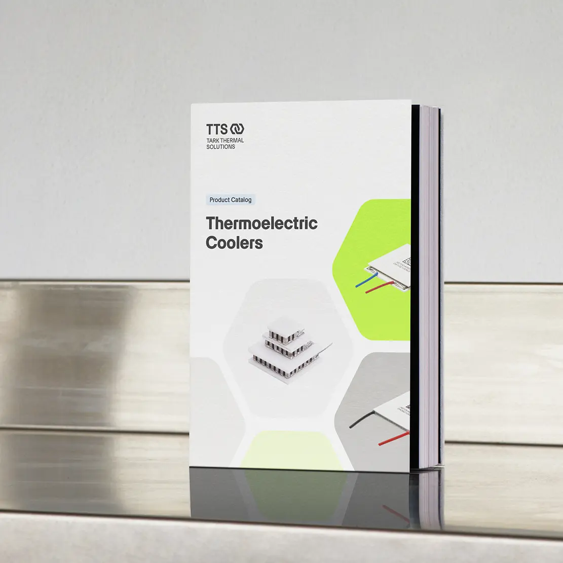
“Artex”, a typeface by the type foundry Optimo, combines technical precision with human accessibility and impresses with its precise lines and gentle curves. The new corporate typeface integrates seamlessly into the new design system and supports the strategic repositioning in every glyph.
This brings the brand identity to life and carries it through systematically into every application.

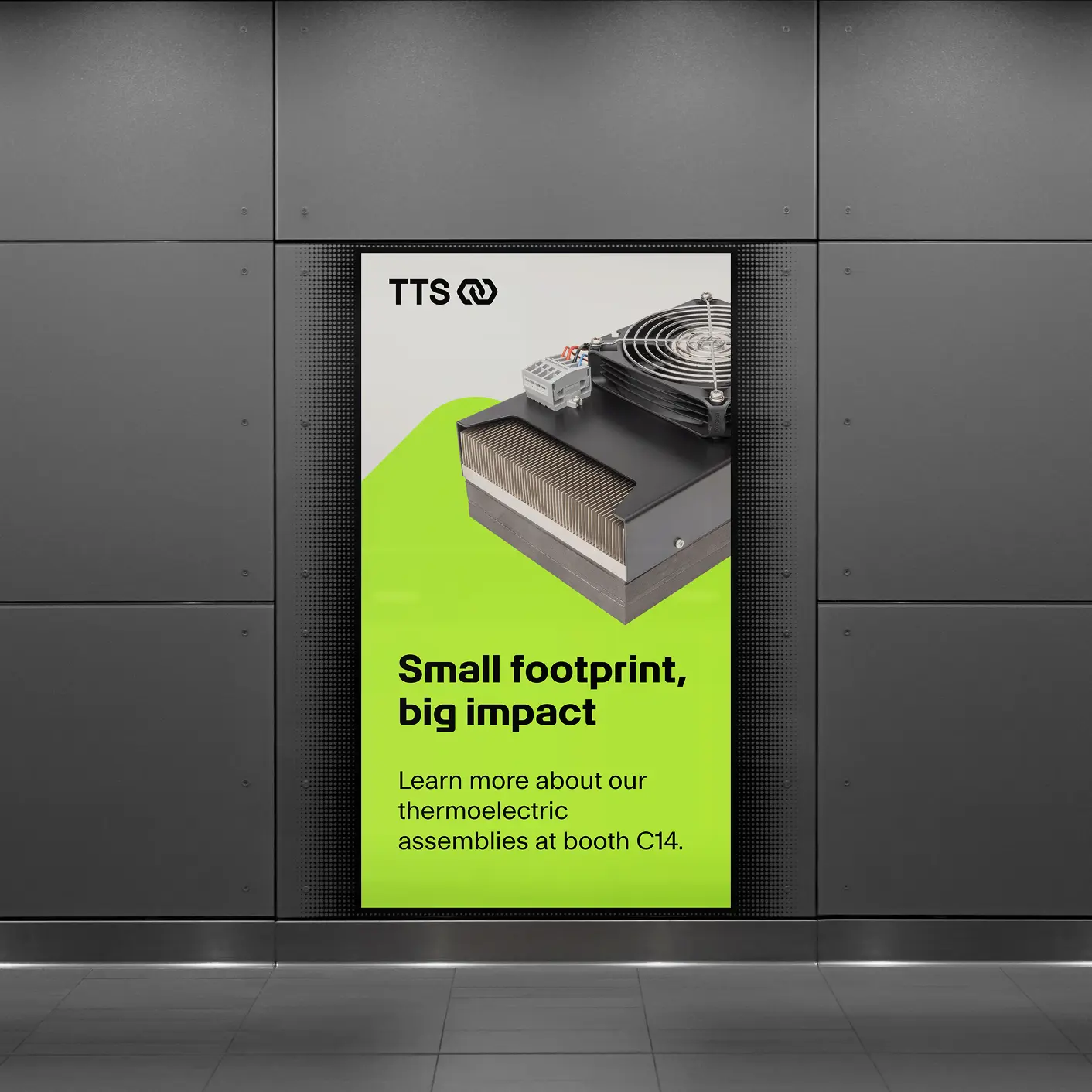
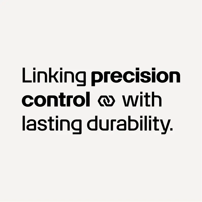
Pairing the graphic mark with taglines can help create synergies and highlight them.
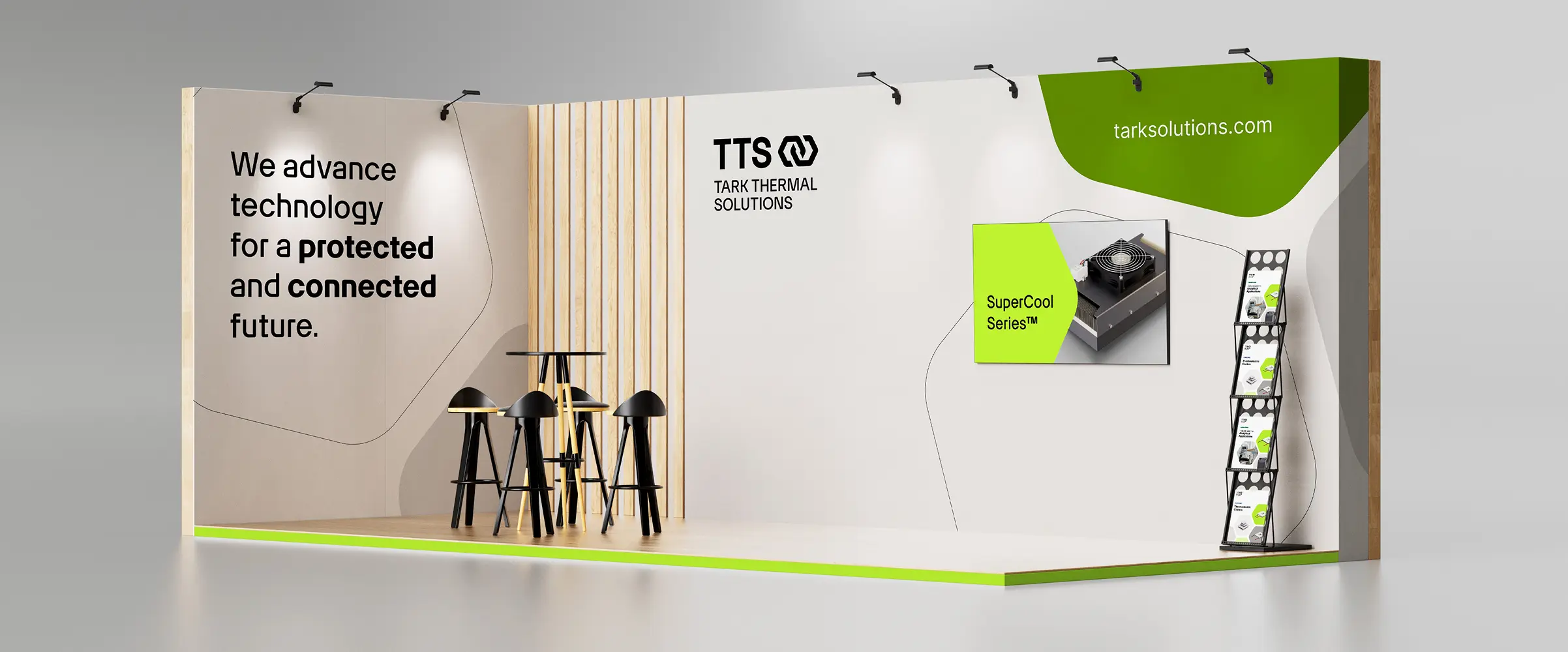
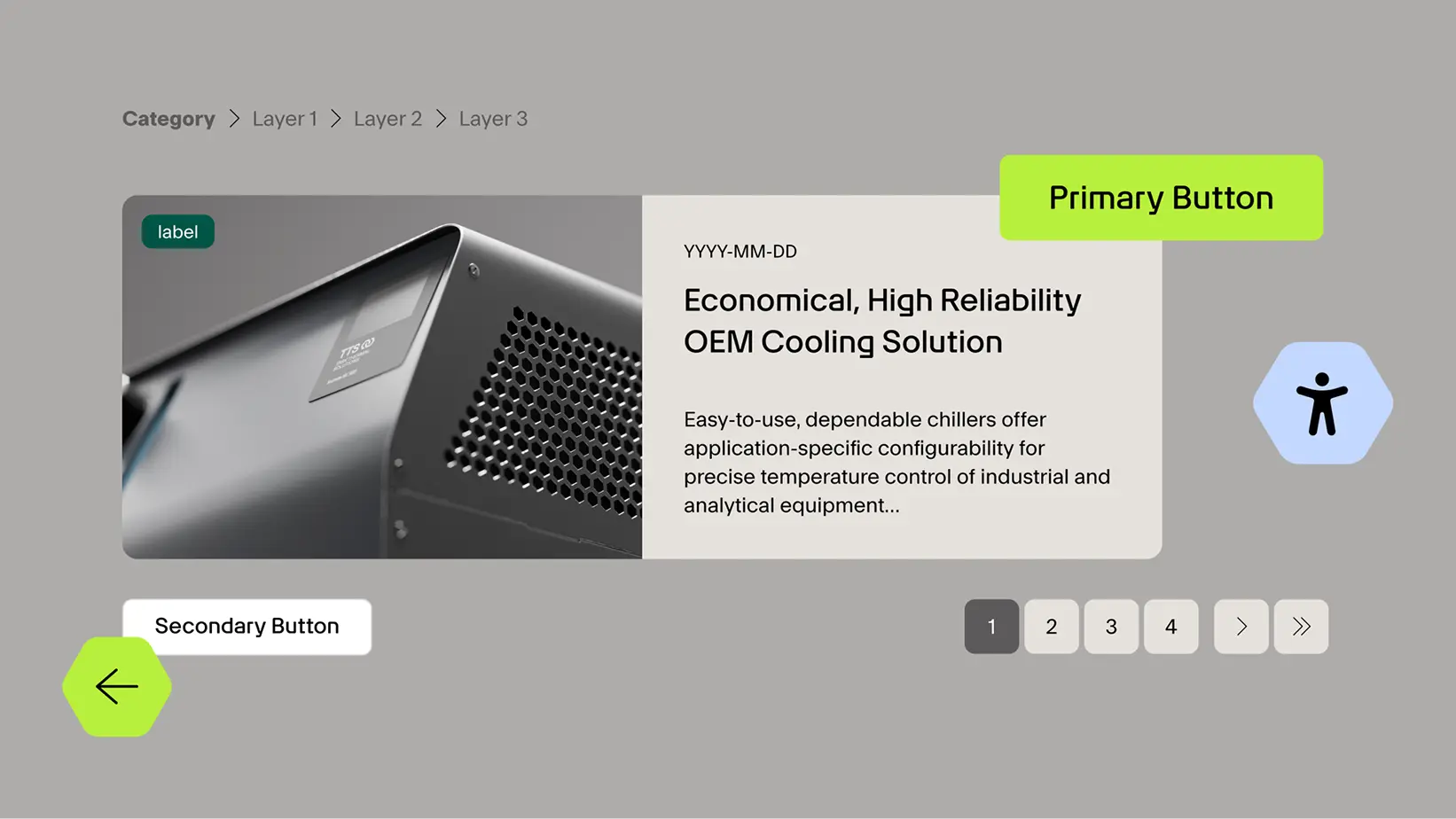
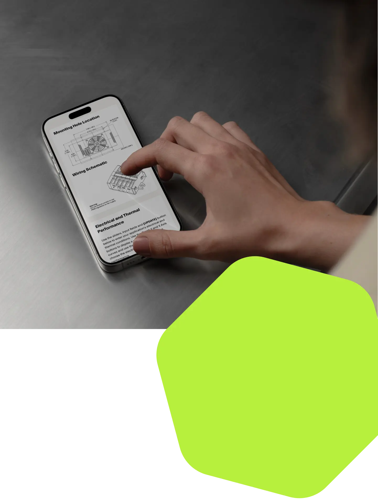
The new website is the brand’s central digital touchpoint, serving as both an information and interaction platform. Its modular design combines a clear structure with a high density of information without compromising visual consistency. The hexagonal design language creates a coherent digital presence that not only presents content in an eye-catching way, but also makes the brand’s outlook tangible and enduring.


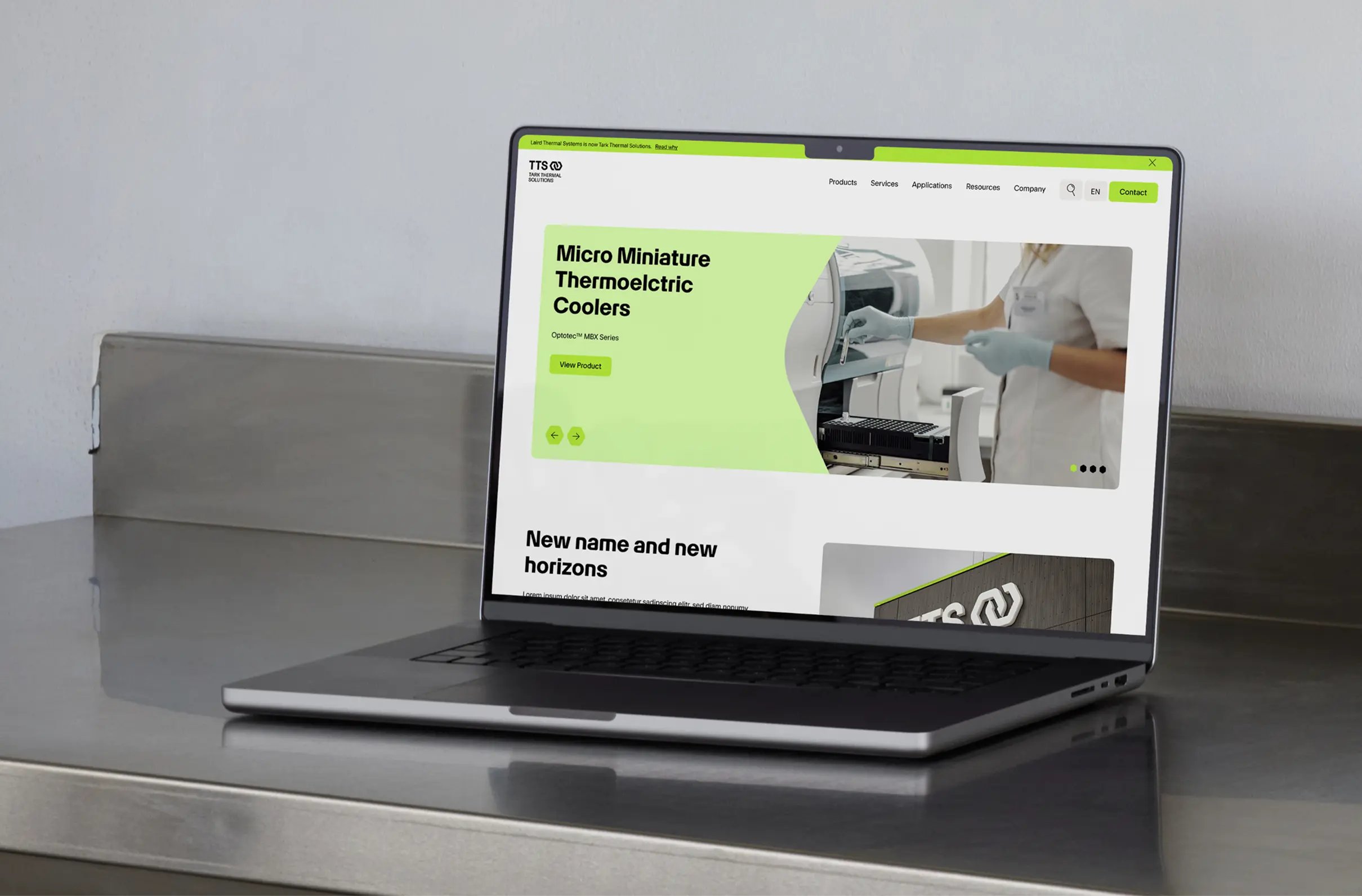
In keeping with its new brand identity, Tark Thermal Solutions presents itself as a global leader in thermal management. Its new positioning creates clarity within the company and sets it apart externally, while consistent implementation gives the business a distinctive profile – globally relevant, technologically leading and clearly positioned for the future.