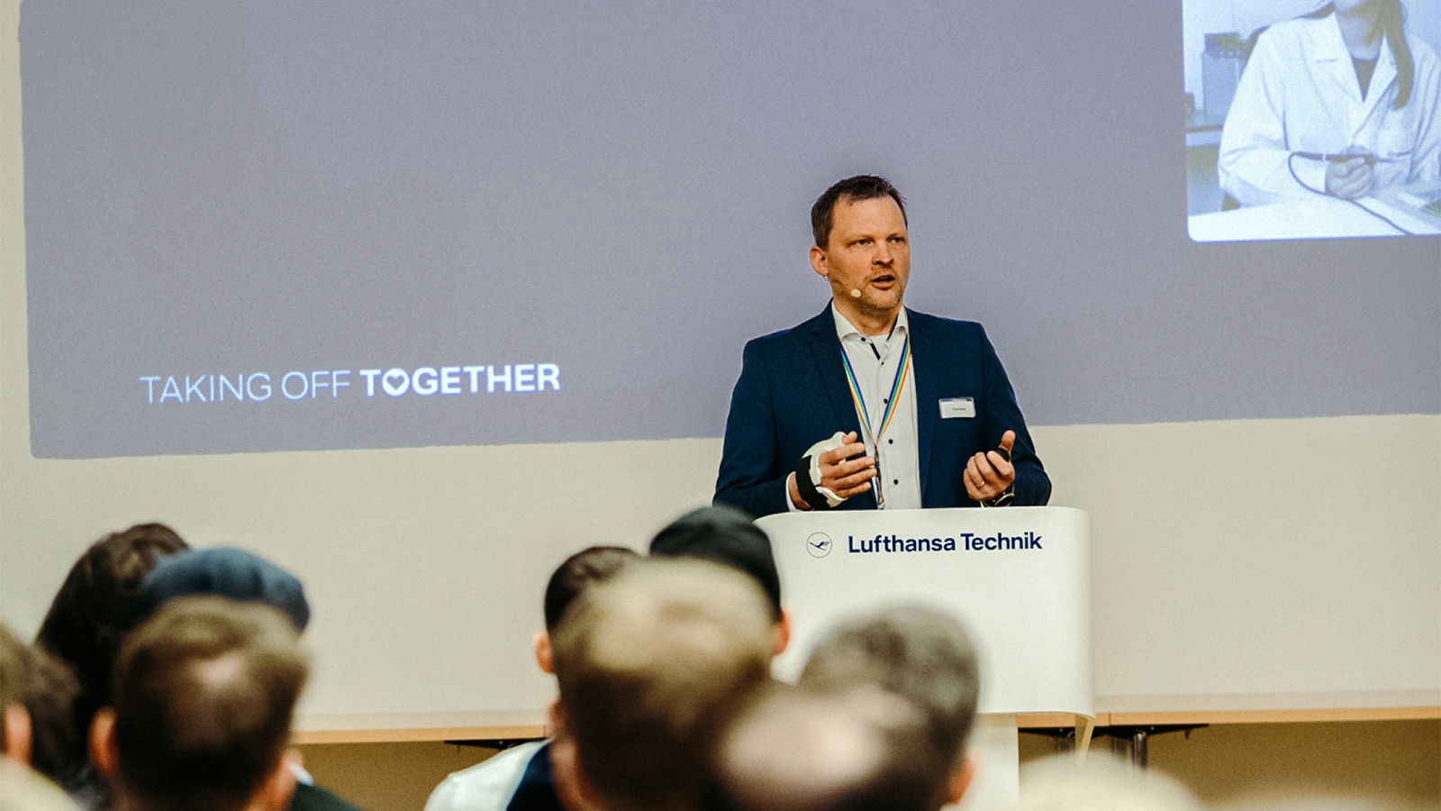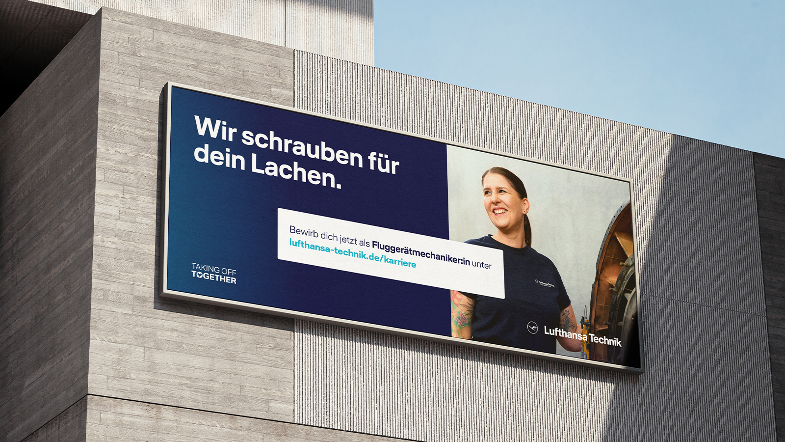
How can a global aviation leader remain relevant to talent in the labour market – today, tomorrow and in the future? Like many companies, Lufthansa Technik faces the varied challenges of a dynamic labour market: skills shortages, digitalisation and new expectations of employers call for a forward-looking repositioning of its employer brand.
Ziel war die nachhaltige sowie zukunftsfähige Neuausrichtung einer Arbeitgebermarke, die Tradition auf einzigartige Art und Weise mit Innovation verbindet. Unter dem Leitmotiv „Taking Off Together“ wurde Lufthansa Technik als attraktiver Ort etabliert, an dem Teamgeist, Engagement und Exzellenz im Zentrum stehen – gemeinsam mit und für die Mitarbeitenden.


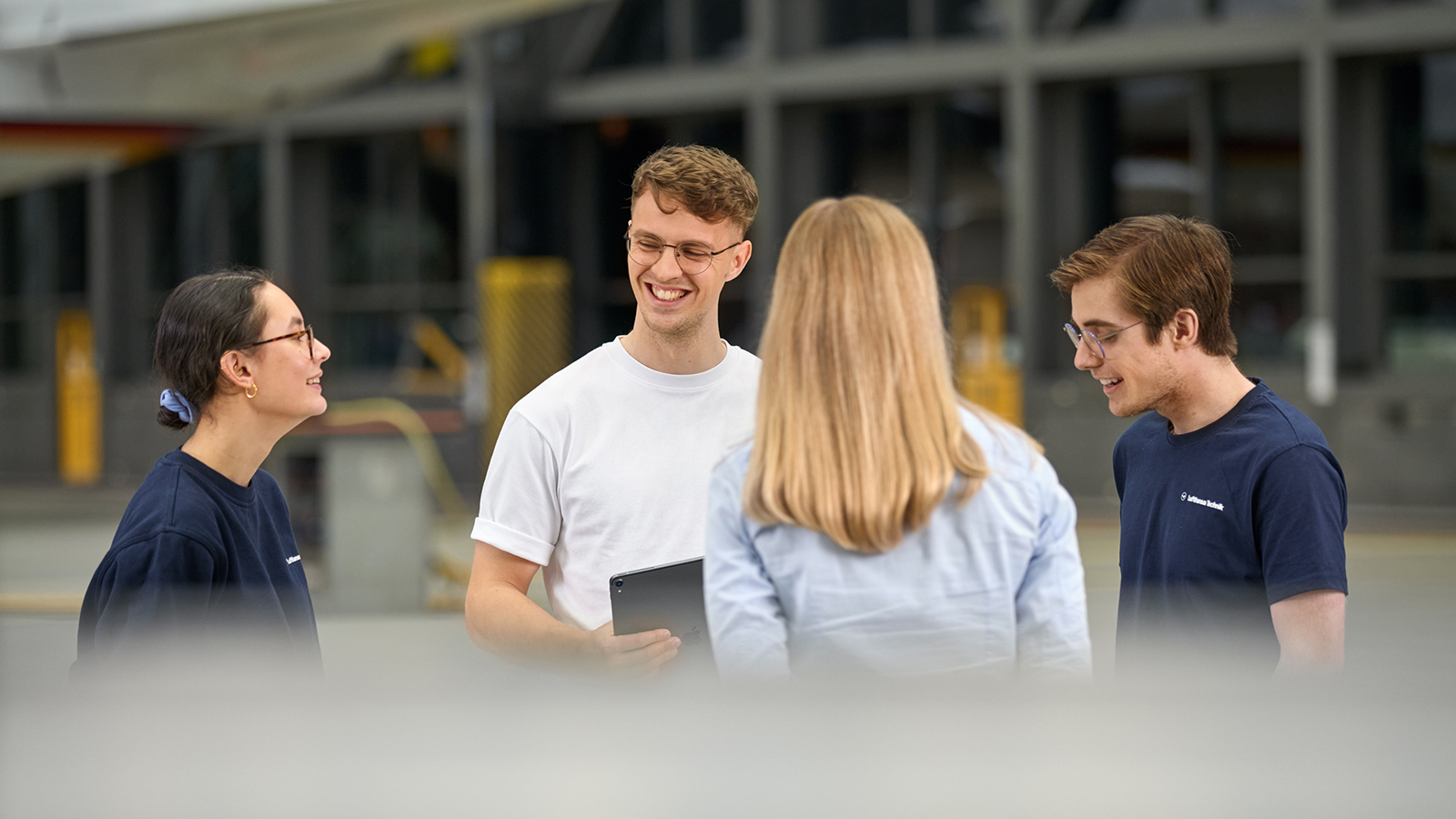
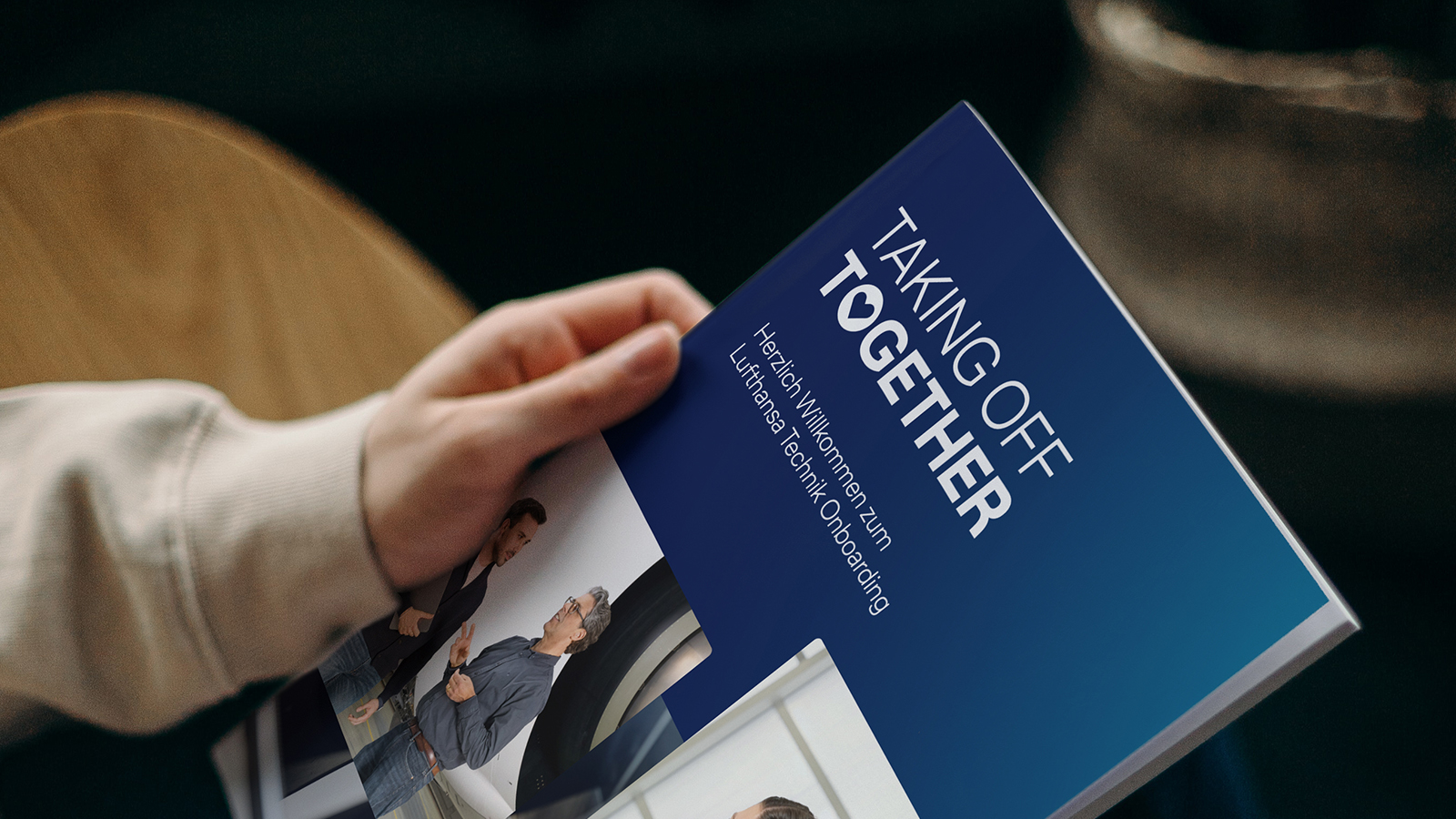
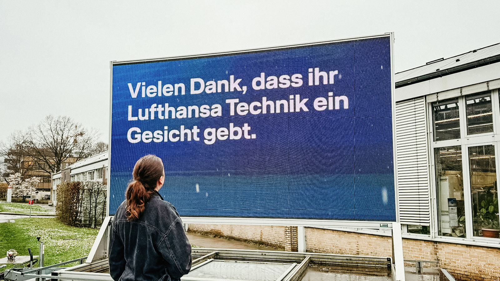
Through a multi-stage strategy process, we developed an identity-based employer brand rooted in the company’s purpose and overarching brand strategy, one that resonates both internally and externally: as an employer brand, Lufthansa Technik stands for technological excellence, international collaboration and genuine appreciation, with a clear focus on individual development, responsibility and team spirit.
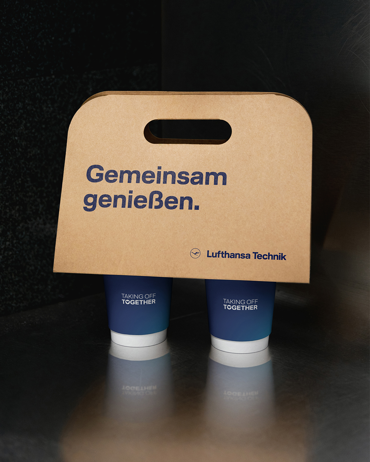
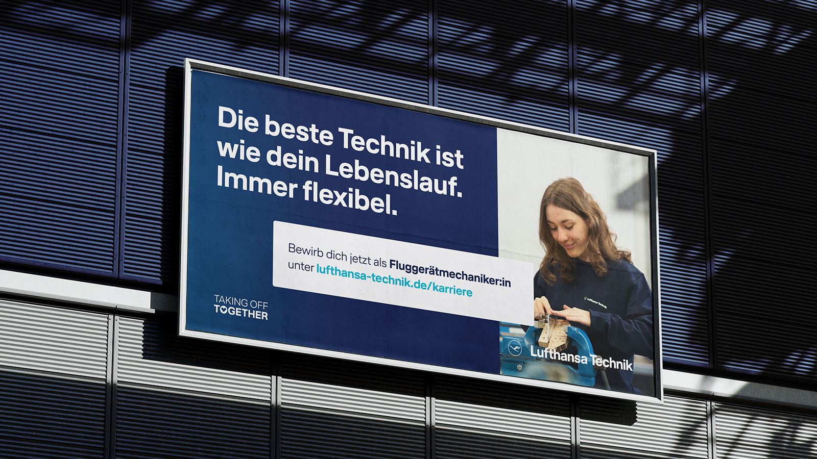
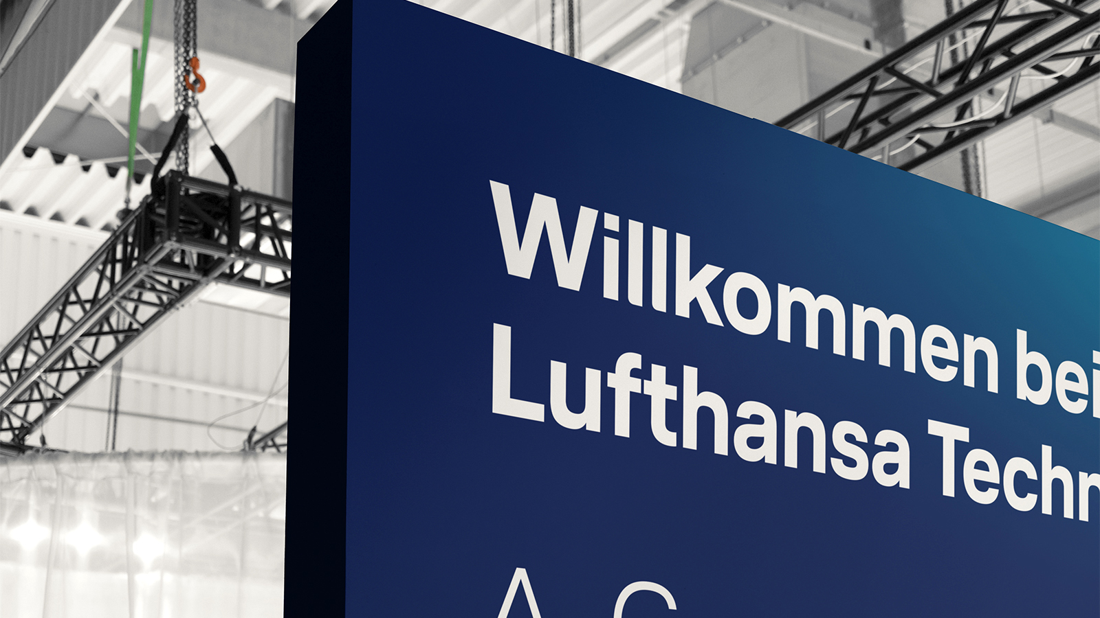
The newly developed employer brand was translated into a visually distinctive, recognisable design system that fits naturally within Lufthansa’s brand identity.
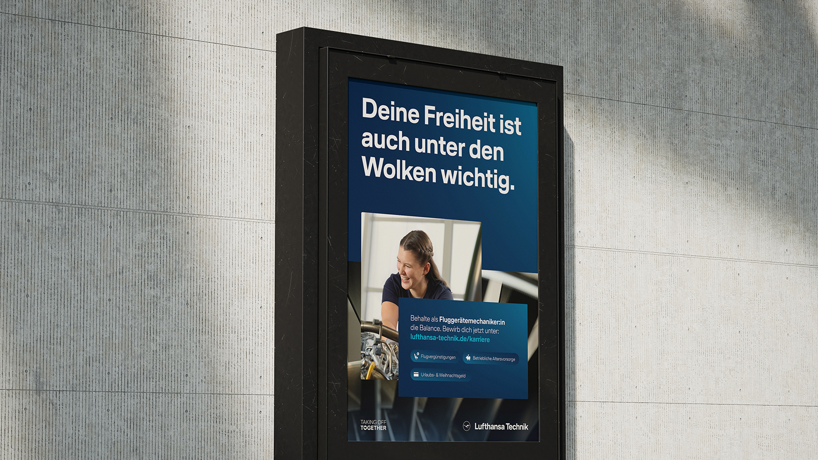
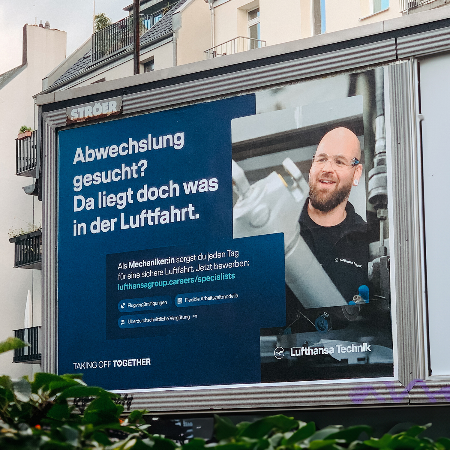
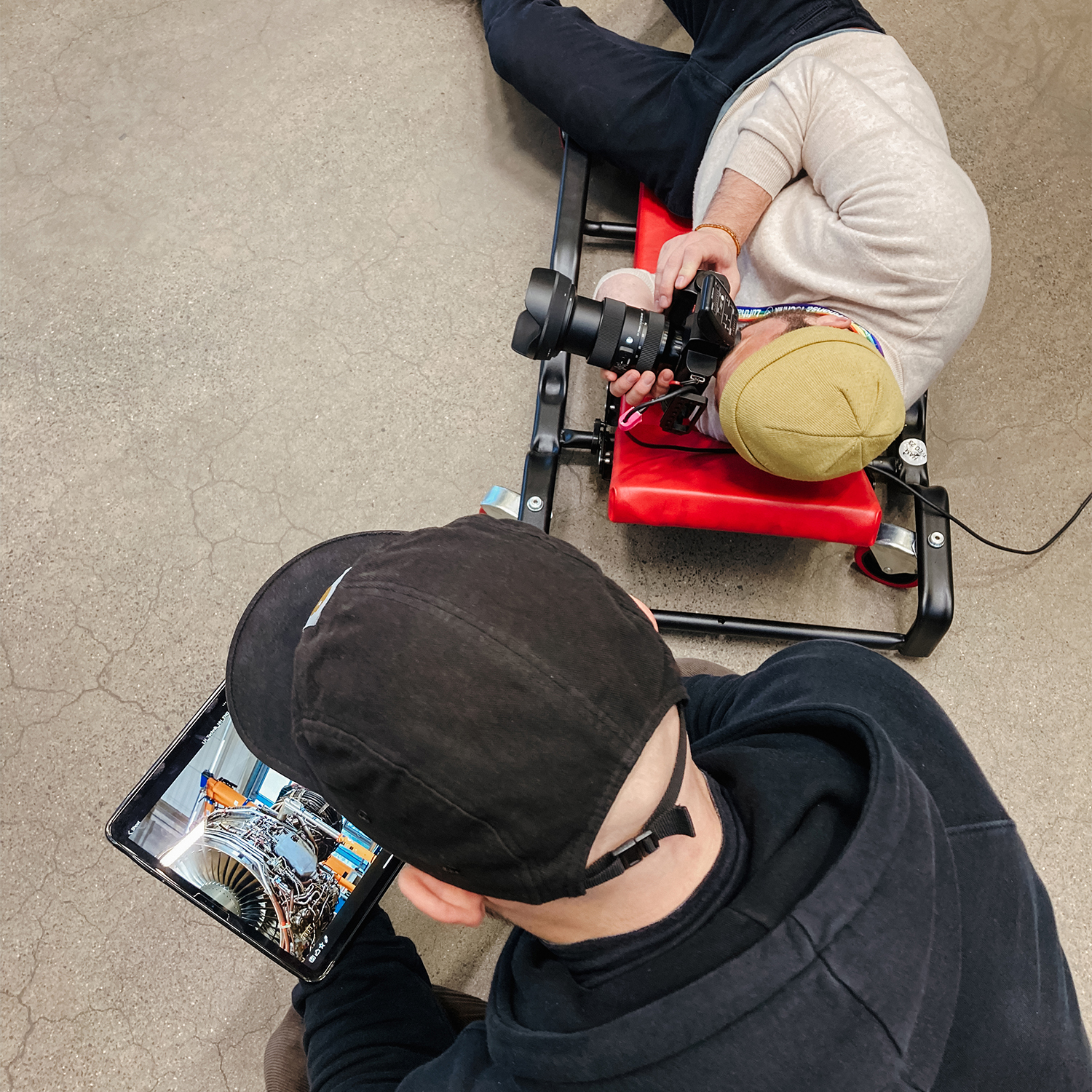
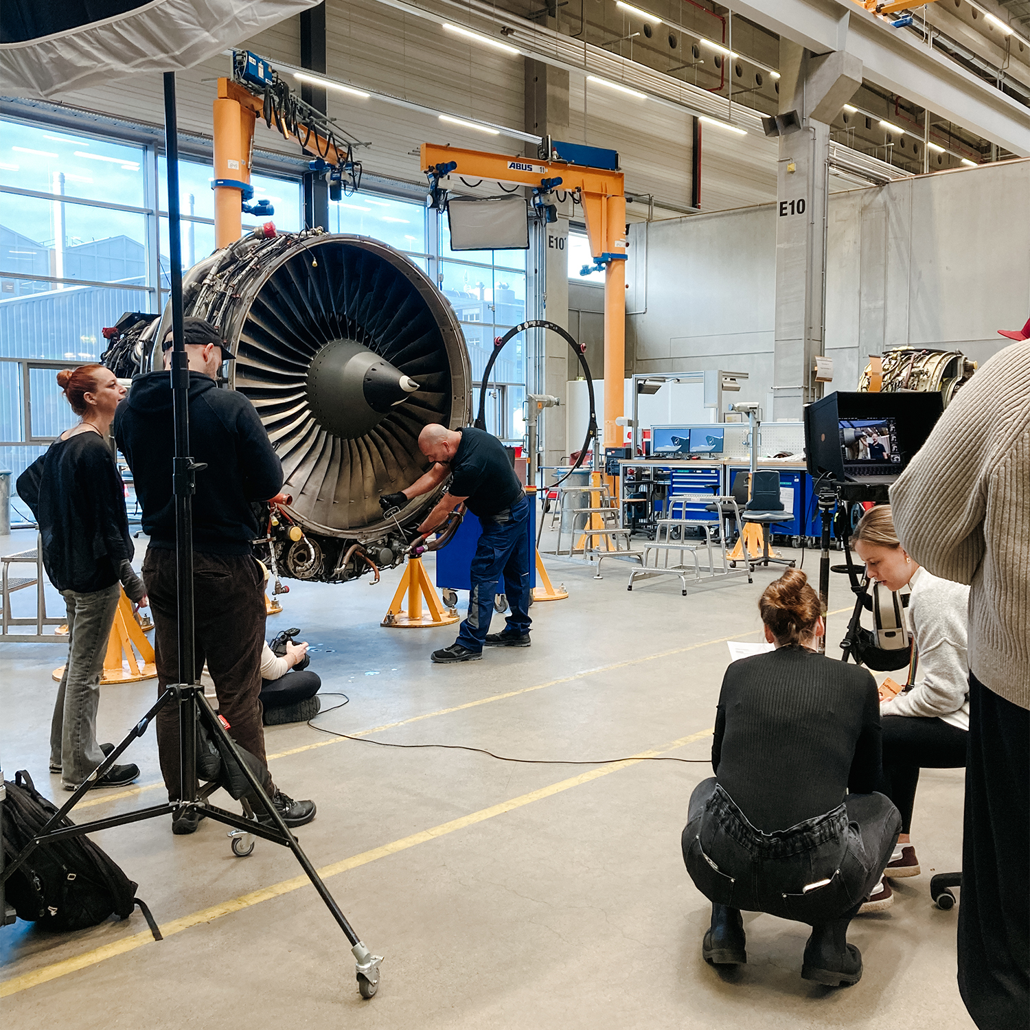
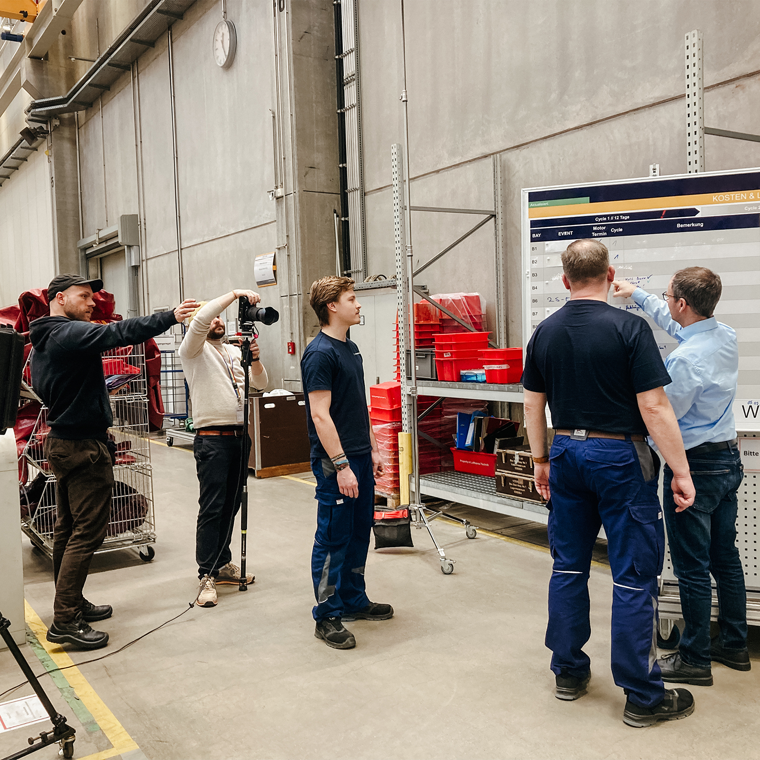
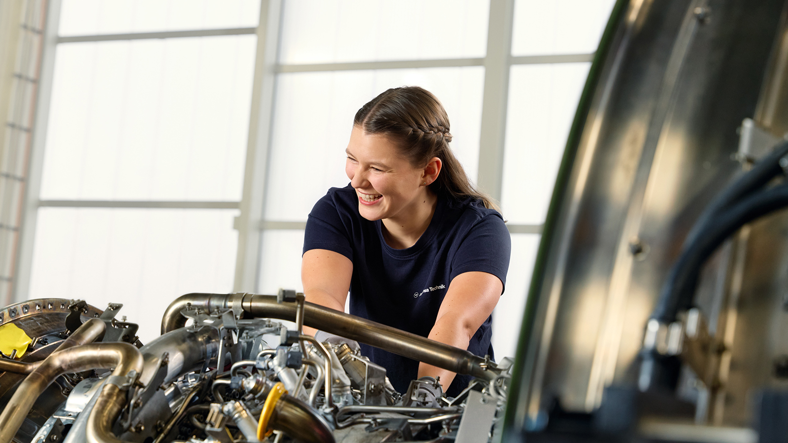
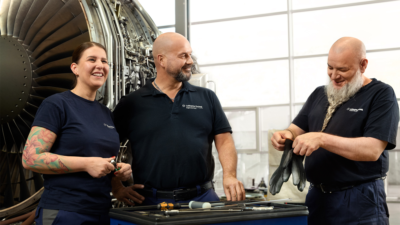
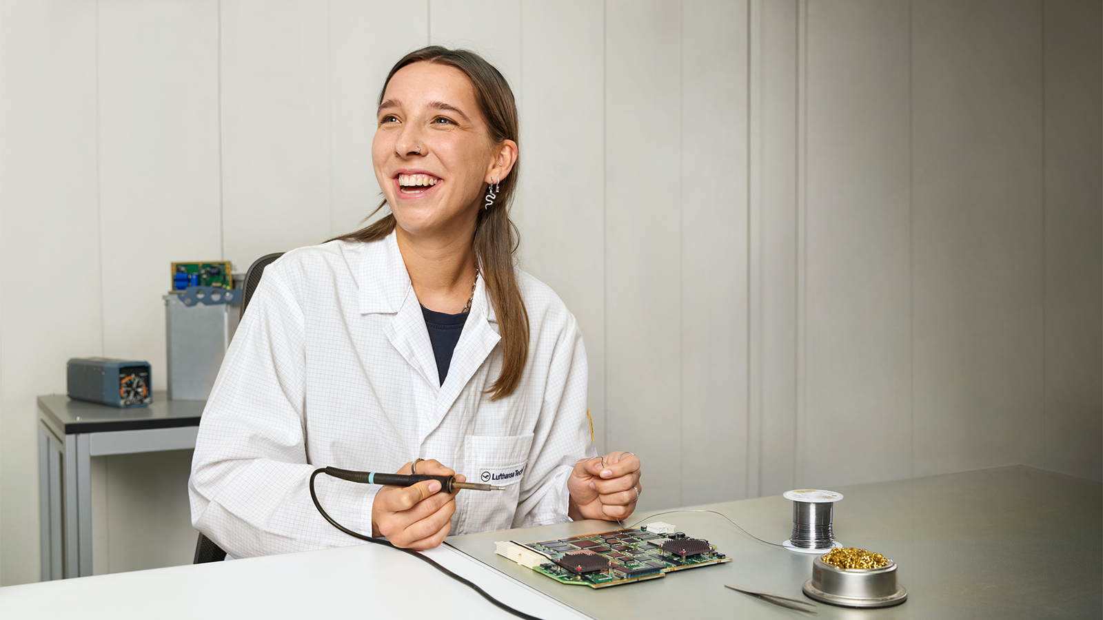
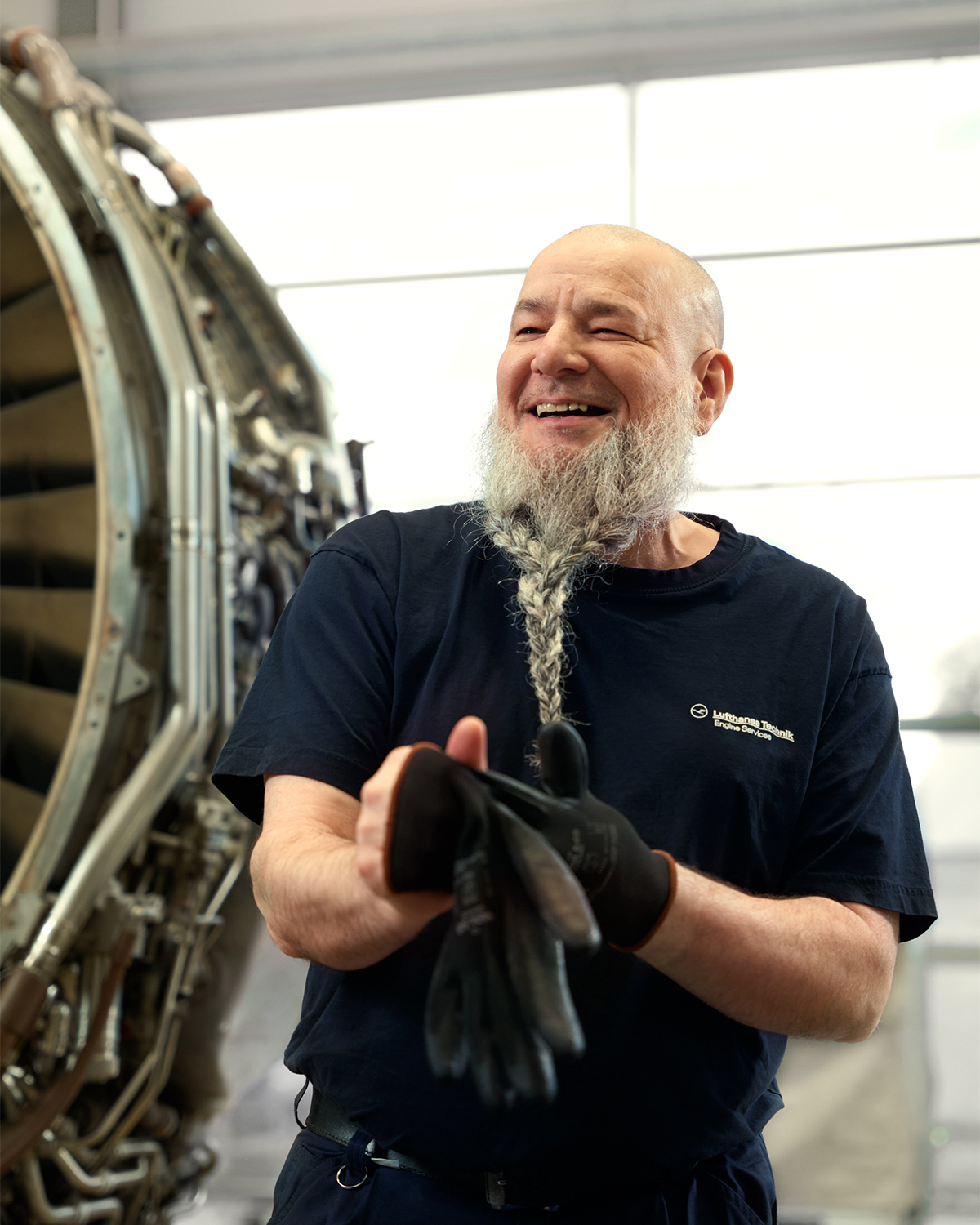
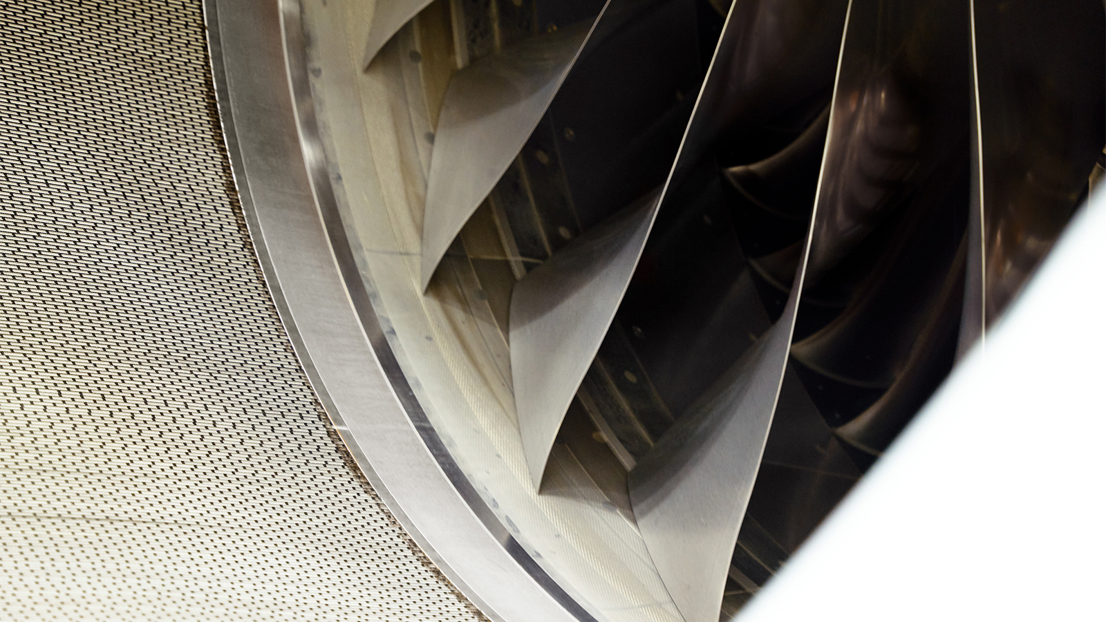
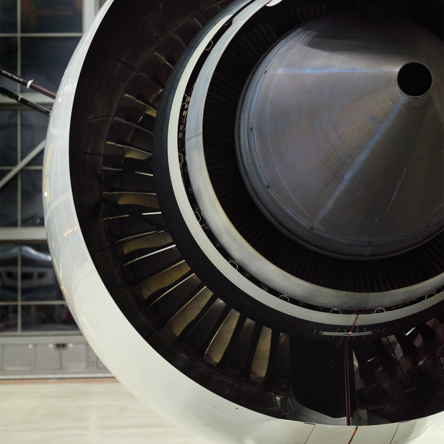
In a bespoke photoshoot, we created a distinctive visual style that reflects the company’s core values and working culture. The combination of warm, authentic images of people and images of machinery that convey structure, professionalism and excellence directly supports the defined brand strategy.
Using a collage in the layout distinguishes between images of people and machinery, allowing each to be brought into focus. The portraits bring warmth, authenticity, emotion and approachability to the design, while the machinery images convey structure, white space, focus and technology.

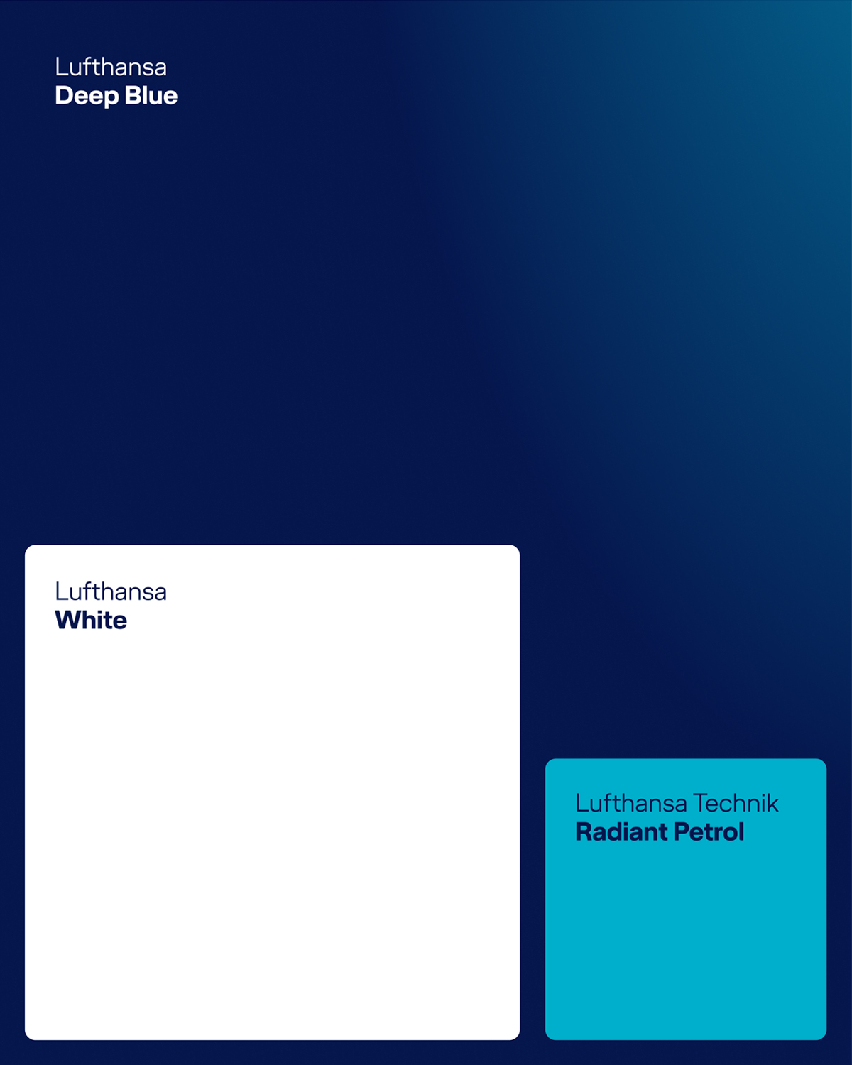
The employer brand typography uses two weights of the Lufthansa Head house typeface. To maintain brand consistency, three established colours from the Lufthansa Technik palette are used: Lufthansa Deep Blue and White define the overall impression, while Lufthansa Technik Radiant Petrol provides targeted accents. The Employer Brand Gradient is also used as a background for formats, boxes and benefit call-outs. In addition to the colour palette presented, there is also the Lufthansa Technik Employer Brand Gradient. It is used as a background for formats, boxes and benefit call-outs.
The employer brand typography uses two weights of the Lufthansa Head house typeface. To maintain brand consistency, three established colours from the Lufthansa Technik palette are used: Lufthansa Deep Blue and White define the overall impression, while Lufthansa Technik Radiant Petrol provides targeted accents. The Employer Brand Gradient is also used as a background for formats, boxes and benefit call-outs.
In addition to the colour palette presented, there is also the Lufthansa Technik Employer Brand Gradient. It is used as a background for formats, boxes and benefit call-outs.
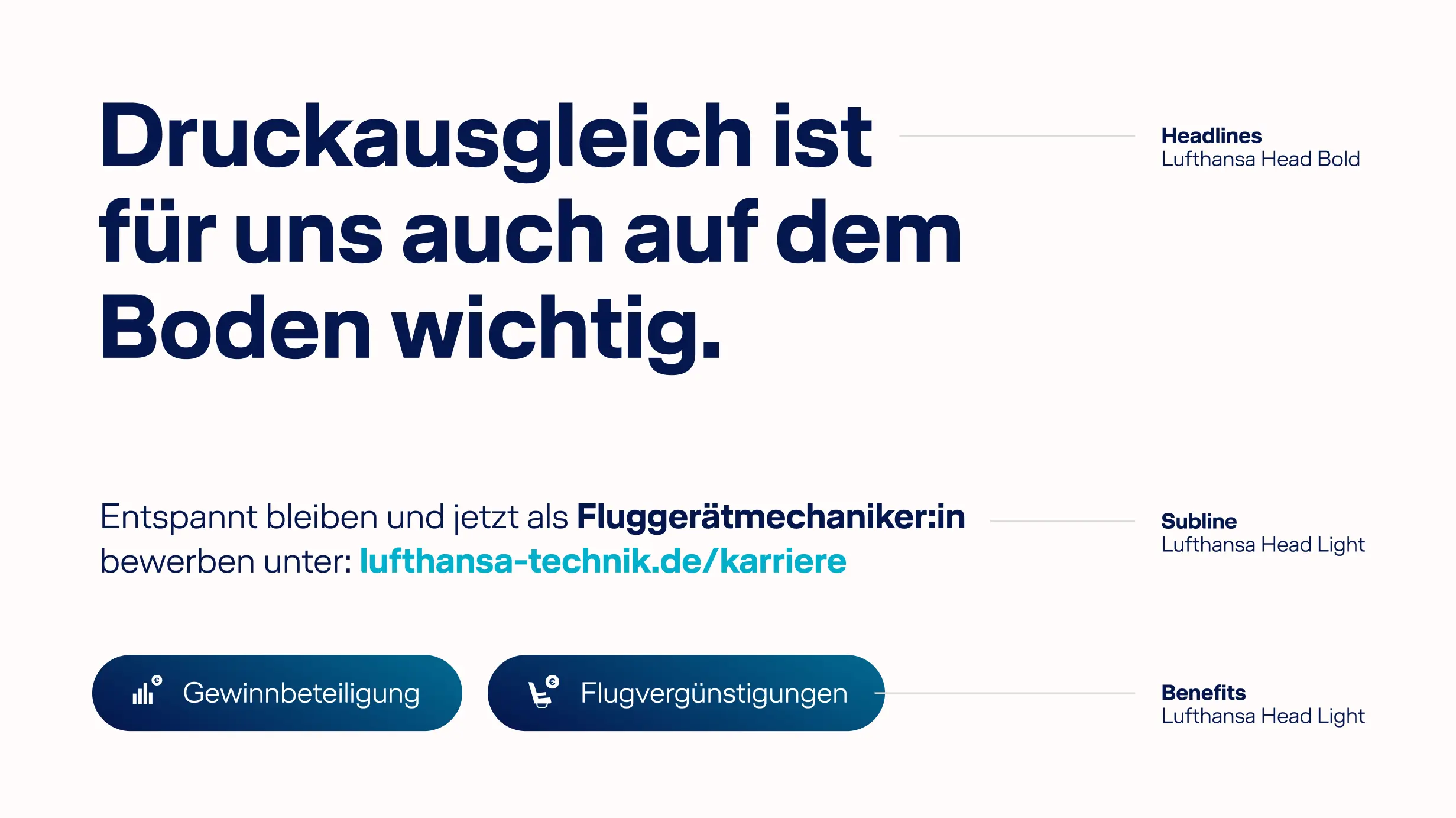

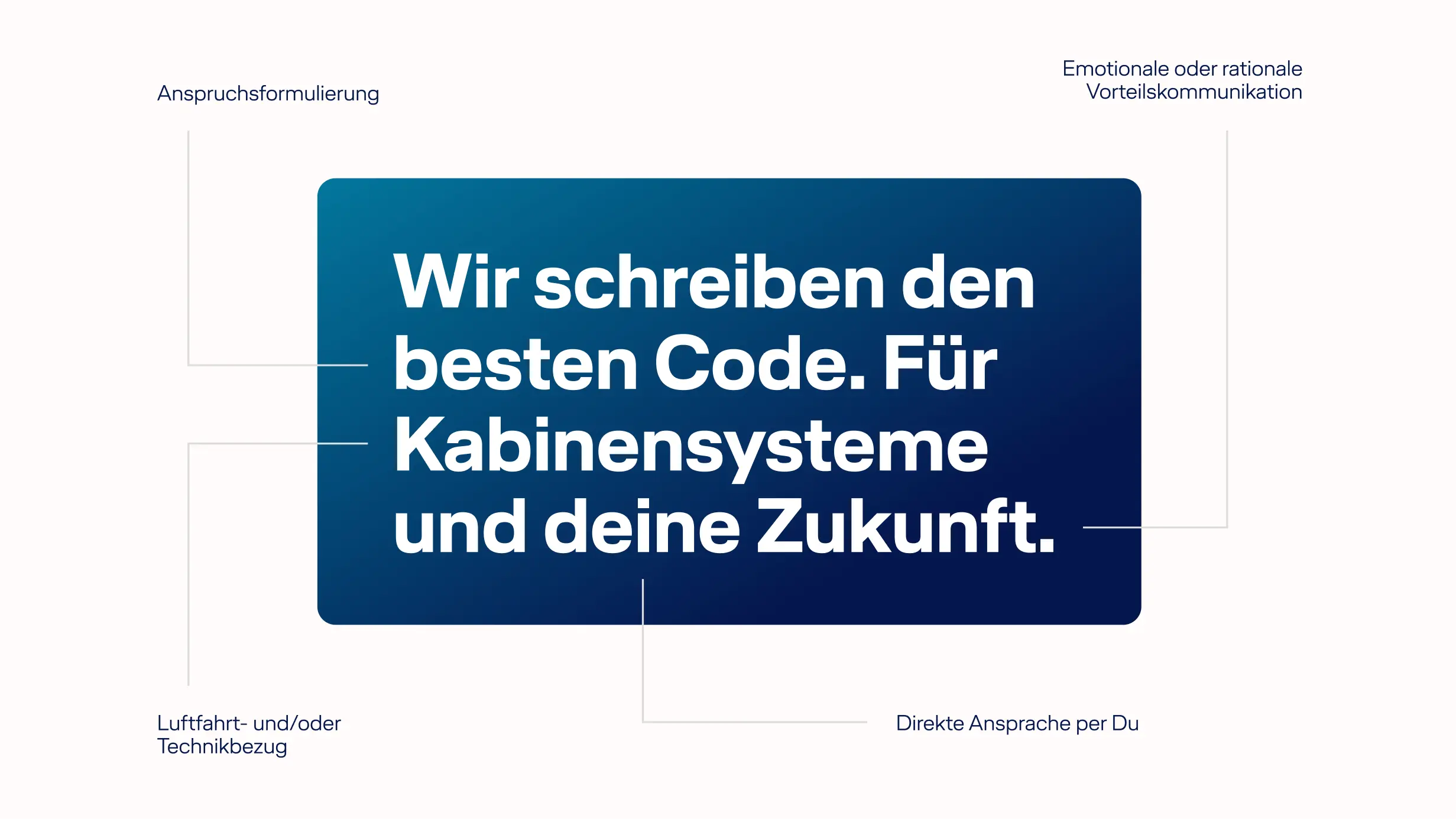
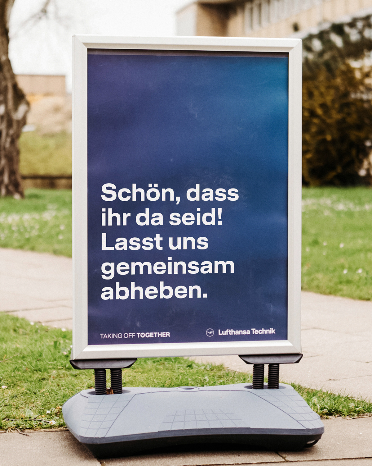
The changing labour market also calls for a new approach to engaging with the target audience: the content and tone should strike a balance between communicating expectations and highlighting benefits – and show that Lufthansa Technik not only offers professional prestige but also meets individual needs. We have therefore chosen language that remains approachable and reflects the realities of the target audience’s lives.
The employer brand’s design follows a specially developed grid that structures every format – portrait, landscape, square, analogue or digital. Cropped images have rounded corners, which, together with the warm visual style, make the brand feel visually approachable.